

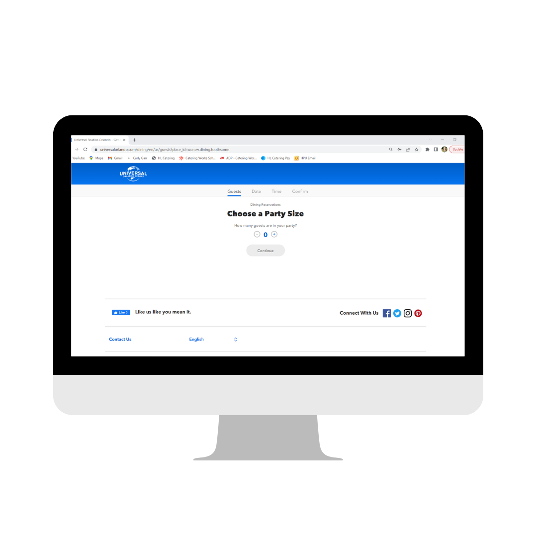
Dining Reservations
All content shown is copyrighted and owned by Universal Destinations & Experiences. This content is shown only to demonstrate some of the work I have accomplished in my role as a Global UX/UI Designer.*
All content shown is currently public and able to view online or at the resorts.

Photo Validation...
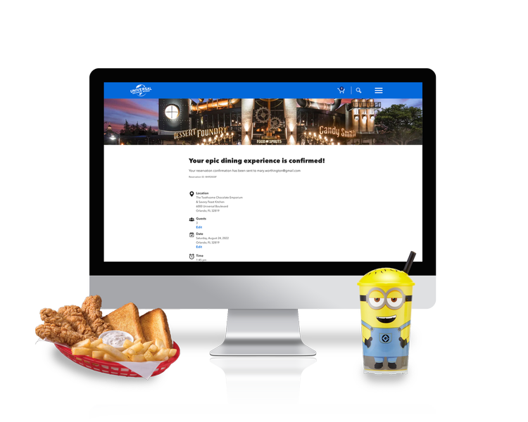
Photo Validation is a first-of-its-kind product at Universal Orlando Resort. This new technology not only simplifies the park entry and crossover experience for our Guests, but cuts down on lines so Guests can get to the fun even faster!
Designing this product was one of the coolest opportunities I’ve had in my career thus far as it takes UX outside of just the web/mobile and allowed me to work in a different space. You’ll see countless months, iterations, research and more were spent on this project, and I’m excited to share it with you.

Roles & Details
-
• Lead UX/UI Designer
• Wireframing
• Competitive Research
• Usability Testing
• Documentation
-
• 1 UX/UI Designer
• 1 Product Owner
• 10 Engineers
-
• July 2022 - July 2023
-
• Sketch
• Invision
• Adobe Creative Suite
The Problem
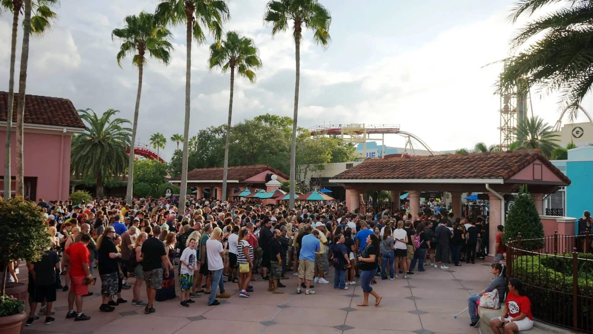
It’s not a secret that Universal parks are among some of the busiest in the world.
Competitive Research
There are many reservation systems that exist in the world, so it was easy to come by many different ways of executing a reservation. What was interesting, though, when performing my competitive analysis, was an obviously lack of usability and accessibility testing. In my designs, I wanted to ensure that I was taking into account all types of abilities, and designing a product that was simple, easy to maneuver, and a system that our Guests feel confident that they can utilize during their trip.
The other theme parks that had Dining Reservation systems also forced their user to log in to an account. During our testing, which I will explain below, this caused a lot of friction and frustration when trying to make a quick, on the go reservation. To ease this friction, we chose to offer the opportunity to log in, but also to continue anonymously.


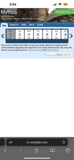
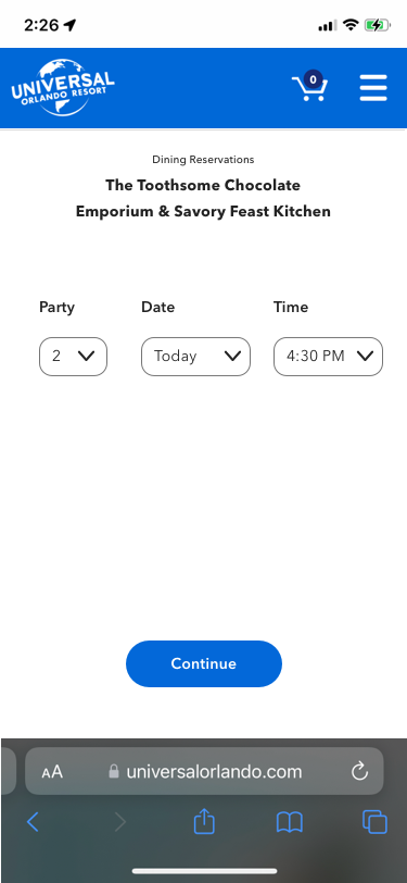
Wireframing with our Design System & Creating Flows
I spent a large amount of time in the beginning of this project creating initial/rough flows of how the user would interact with this product - and how they would get from Point A to Point B. A main challenge and constraint in this work was designing according to our already existent design system components. Throughout the wireframing journey, I ended up experimenting with adding ‘new’ components that could be reused, but also manipulating our existing components.

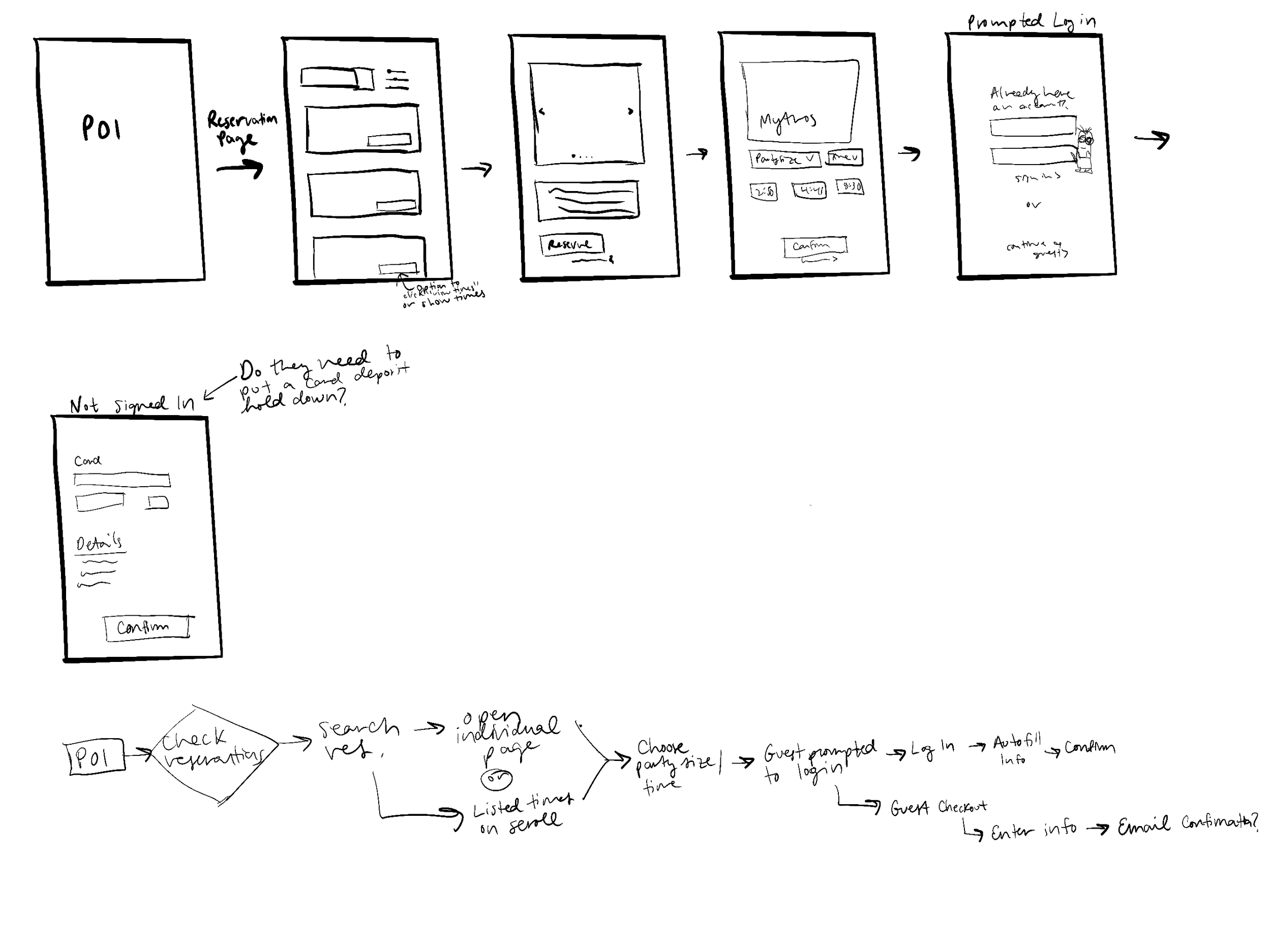
Working closely with our Product and Solution Architecture team, I was able to identify the flow that we needed to follow. There were a lot of use-cases that we needed to take into account as well. It was helpful for me to have everything as mapped out as possible before getting too deep into the wireframing.
After completing initial rough designs, I mapped out the flows and continued onto some more high-fidelity wireframes.
Mapping out Flows
Beginning to Wireframe
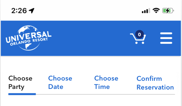
This was the part of the project where I had the most amount of fun. While we did need to stick to already existing components within our Design System, I was able to let my free thinking out and experiment with what could potentially work as our solution. Since the demographic of this project is so large (anyone who visits a Universal Park), it was important to design a simple process for users of all ages, background, etc. With the timeline being such a short turnaround, I hopped straight into High-Fidelity mockups.
Testing Out Ideas:
One of the first initial ideas was to create a step-by-step process. I really liked the simplicity of this, and wanted to test it as well. But, before going too deep in one direction, I explored a few other options as well.
Idea 1:
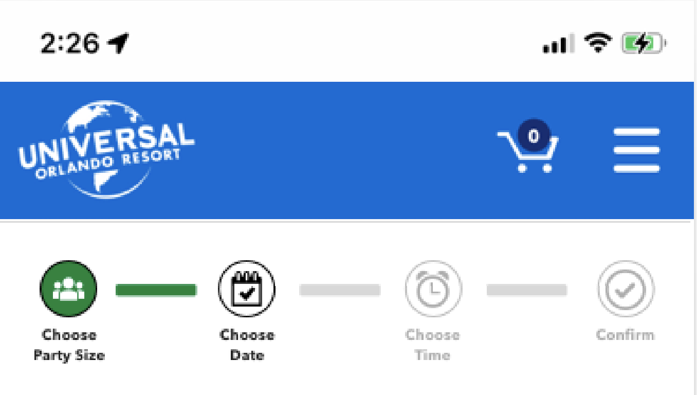
If we did move forward with the ‘step-by-step’ approach, something I knew wanted to incorporate was the idea of a ‘tracker’.
This would help even the greenest user to follow along with their selections, and where they were in the reservation process.
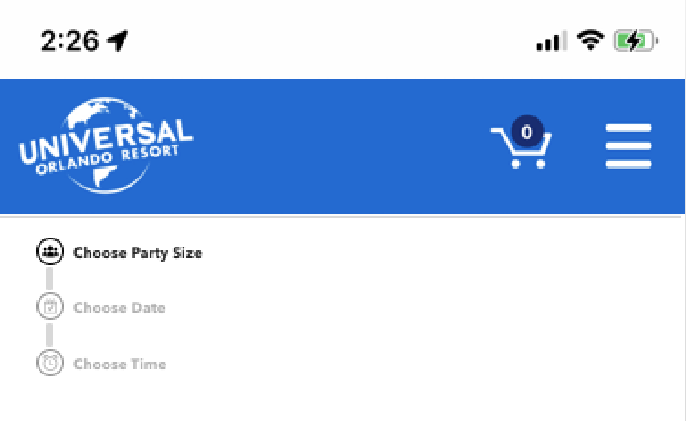
Idea 2:

Another item I explored was this dropdown approach. This got rid of the need to have a ‘tracker’, but a negative was that it would also make users have to scroll pretty far down if they were booking far in advance.
Idea 3:

I also wanted to experiment with what it would look like to have everything on one page. It was a bit too overwhelming seeing it all laid out on one page, but I always think it’s worth exploring all of the potential options if you have the time to do so.
Combining my first iterations with my research helped me to decide that the step-by-step approach was probably going to be the best solution for our user, as well as allow us to integrate our design system more fluidly. I started playing around with some potential other ways to track the reservation as the user when through the process. Some of these were not in our design system, but helped to spark ideas on what we could make that was already in existence/is a reusable component. We ended up going with this tracking navigation on the right.
User Zoom Testing
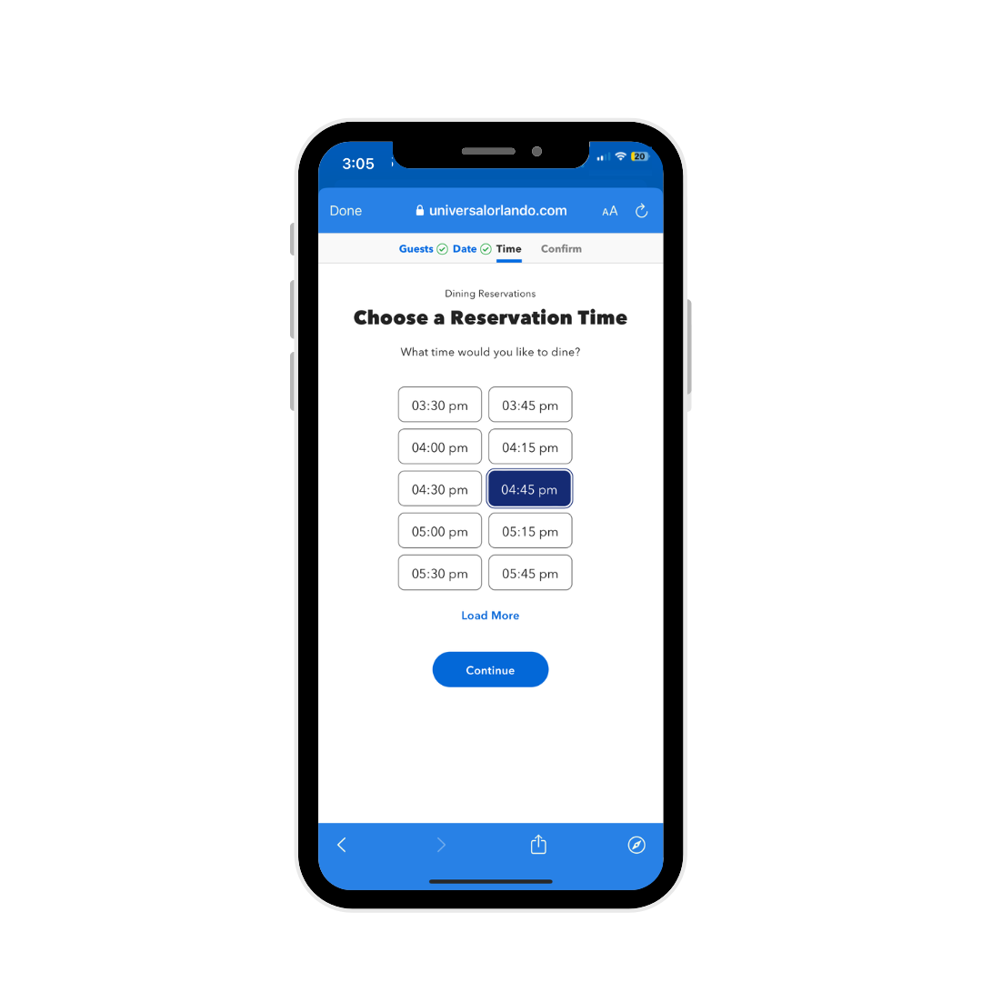
There’s no better way to confirm that the experience you crafted is actually functional and a successful user experience, than with usability testing. After doing a bit of on-site testing with current Team Members, I created a few tasks that our testers on User Zoom would complete. I came up with four separate tasks, and created individual prototypes for each.
Prototype for Task #1
After creating an in depth testing brief that included the reasonings behind the questions asked, my hypothesis, and ultimate goals for testing, I identified that my main goal was to understand how simple it was for the User to get through the booking flow (given our constraints).
The four tasks we asked them to complete were:
#1: Navigate to Dining Reservation Flow
#2: Book a Reservation
#3: Edit Your Reservation
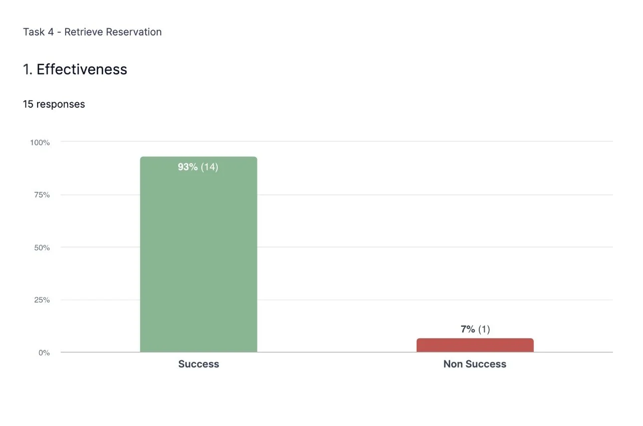
#4: Retrieve Your Reservation
Being able to identify insights such as time it took for the User to get from Point A to Point B, and hearing them speak aloud through the process was immensely helpful.
User Zoom Results
15
Participants
93%
Successfully Located Their Previous Reservation
100%
Successfully Edited Their Reservation
1 Min
Average Time to Locate Dining Reservation Flow
86%
Excited For New Dining Reservation Experience
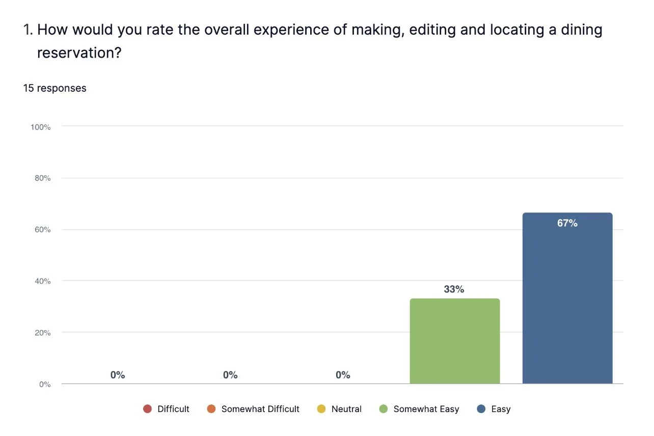
After 15 participants completed these tasks, we had some good feedback for moving onto our final designs. See below for some additional statistics:
Reviewing Feedback
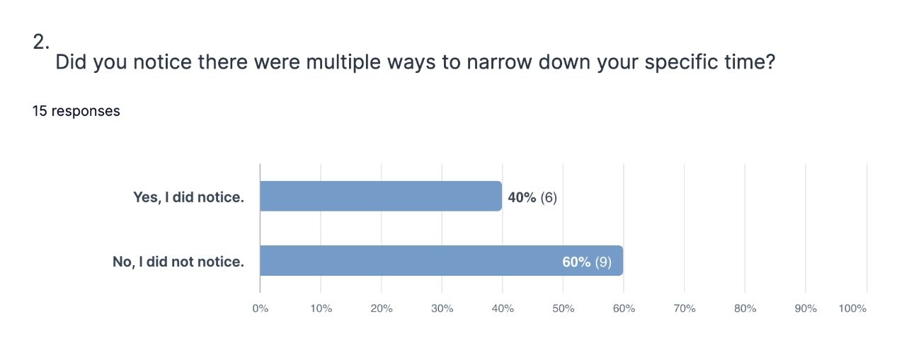
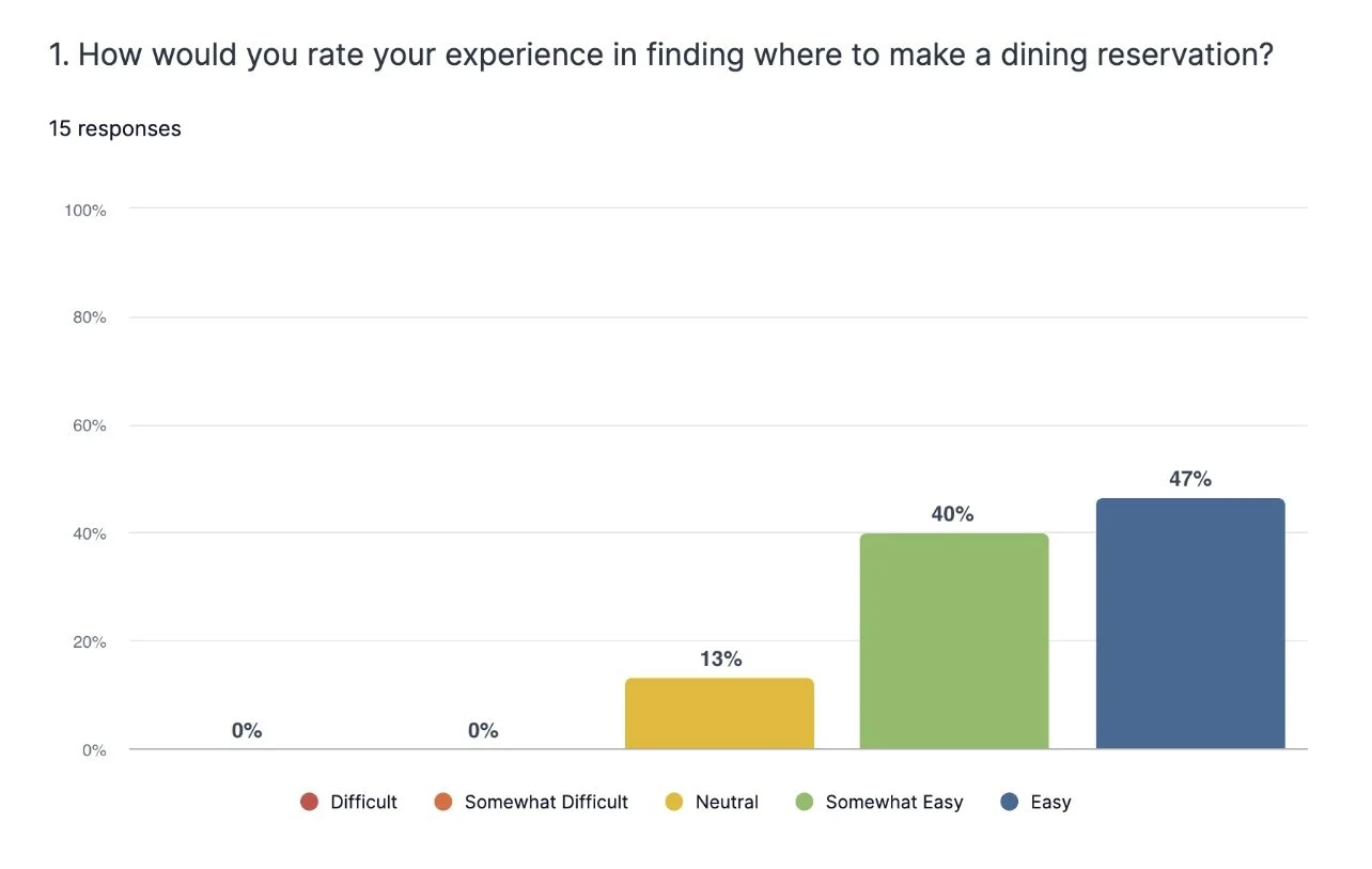
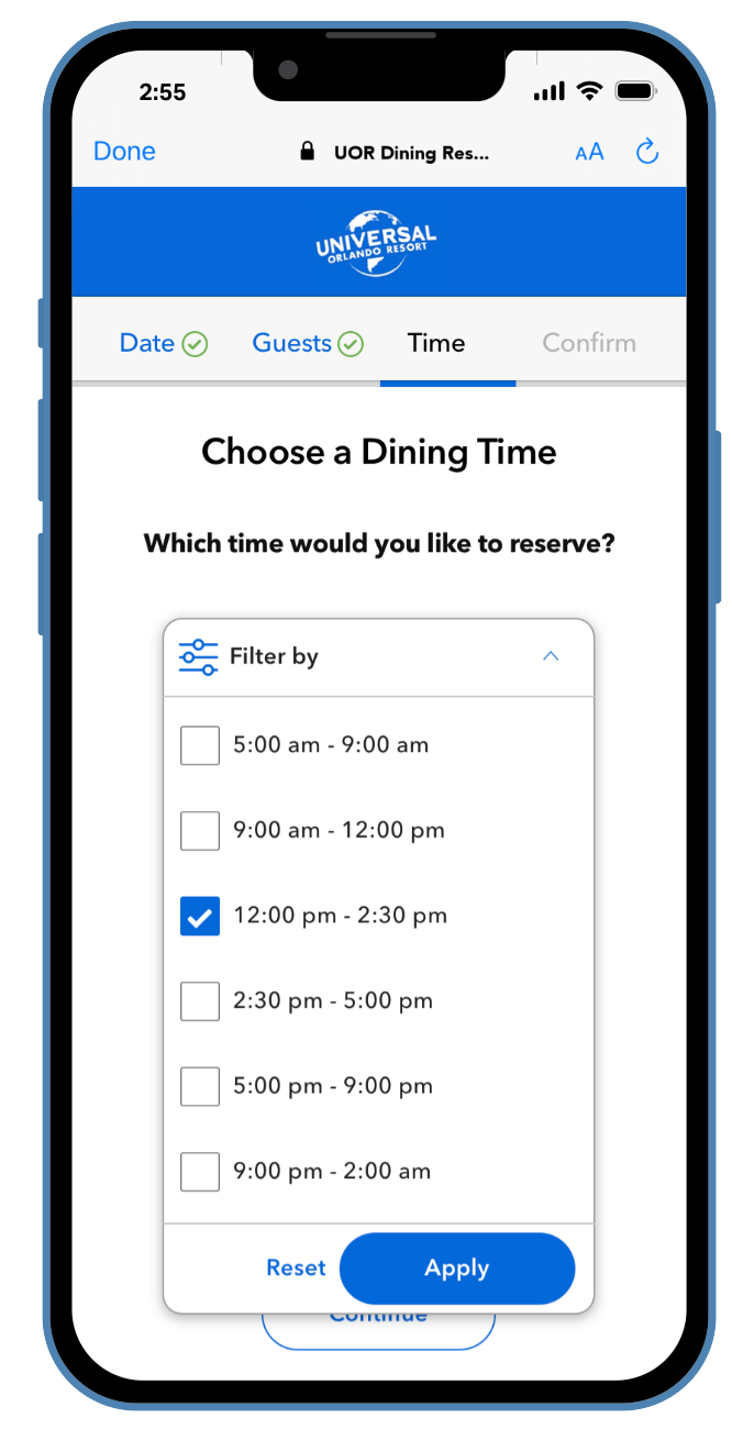
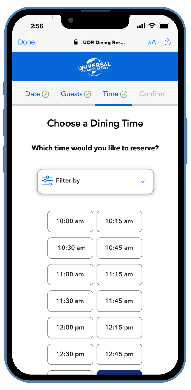
I was able to review the User videos and watch what the User interacted with, in addition to how many clicks it took them to reach the correct path. This was super helpful. One of the options we had was filtering by time of day to narrow down times, and this User Test helped to identify that it may not be needed - and was just adding friction for the User, so I removed the feature.
This is a great example of how testing can help you understand what the user really needs, and to remove additional noise. There was mixed feedback about needing to ‘load more times’, but not 1/15 users touched the filtering option. I even added a follow up question asking: “Did you use or notice that filtering was an option?” And none of the testers answered yes.
So, during the post-test iterations, filtering was scrapped.
After the great feedback from usability testing, I made my final iterations and cleaned up the rest of the design. To reiterate, this project had to be designed completely in our pre-existing design system. So I was able to manipulate our components to create the best possible experience for our users, and one that we can use again to keep a consistent design experience throughout the entire brand.
Iteration & Documentation
This project was approached as a mobile-first product as most Guests access Dining Reservations from their phones. But since it was a web based product, a desktop version was needed as well.
Working Through Use Cases
Throughout the designing of this Product, we needed to keep in consideration where these reservations would live after confirmation, as well as specific use cases that would appear. Below, you can see just some examples of the many tedious use cases that we discovered upon designing and building. There were many possibilities that we needed to add into the flow; whether that be through a modal, message, etc. It was crucial to ensure we resolved all potential use cases that could occur during this booking process.
Most Common Use Cases:
What happens if the Guest is in the middle of a reservation, and the time/date/guest count they chose becomes full before they can confirm?

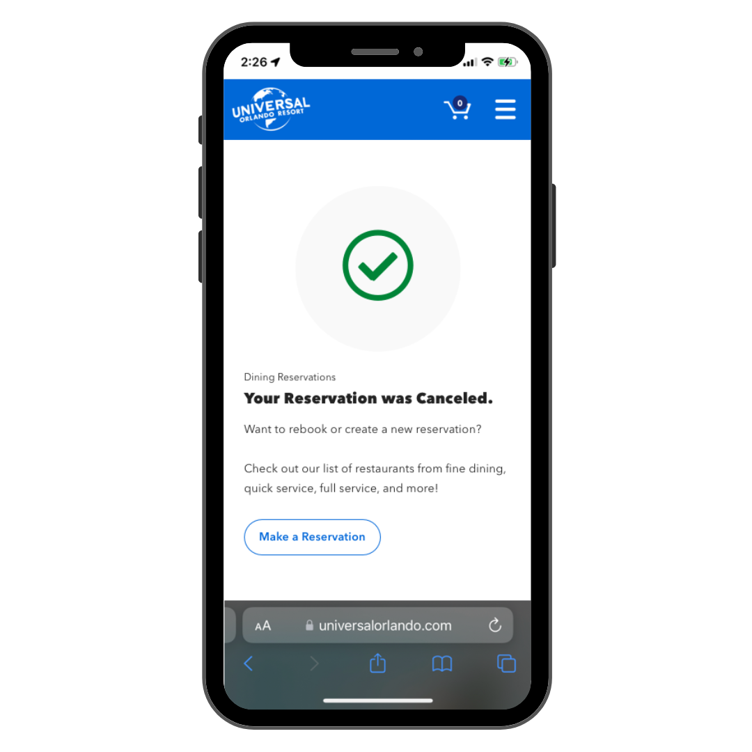
How does it look when a reservation is cancelled?
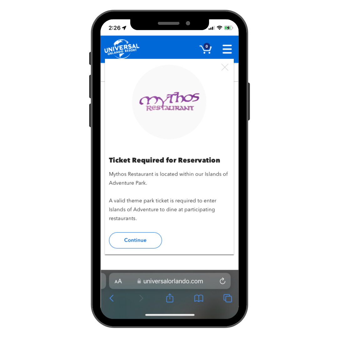
What if the Guest needs to have a park ticket for a specific restaurant they book for?

What happens if the Guest wants a larger Party Size than available on the reservation request?
Many of our ‘use cases’ allowed a similar approach. Whether that be a pop-up modal, or a separate screen. This approach was helpful since there were quite a few use cases that our Users could experience, and this left a consistent approach.
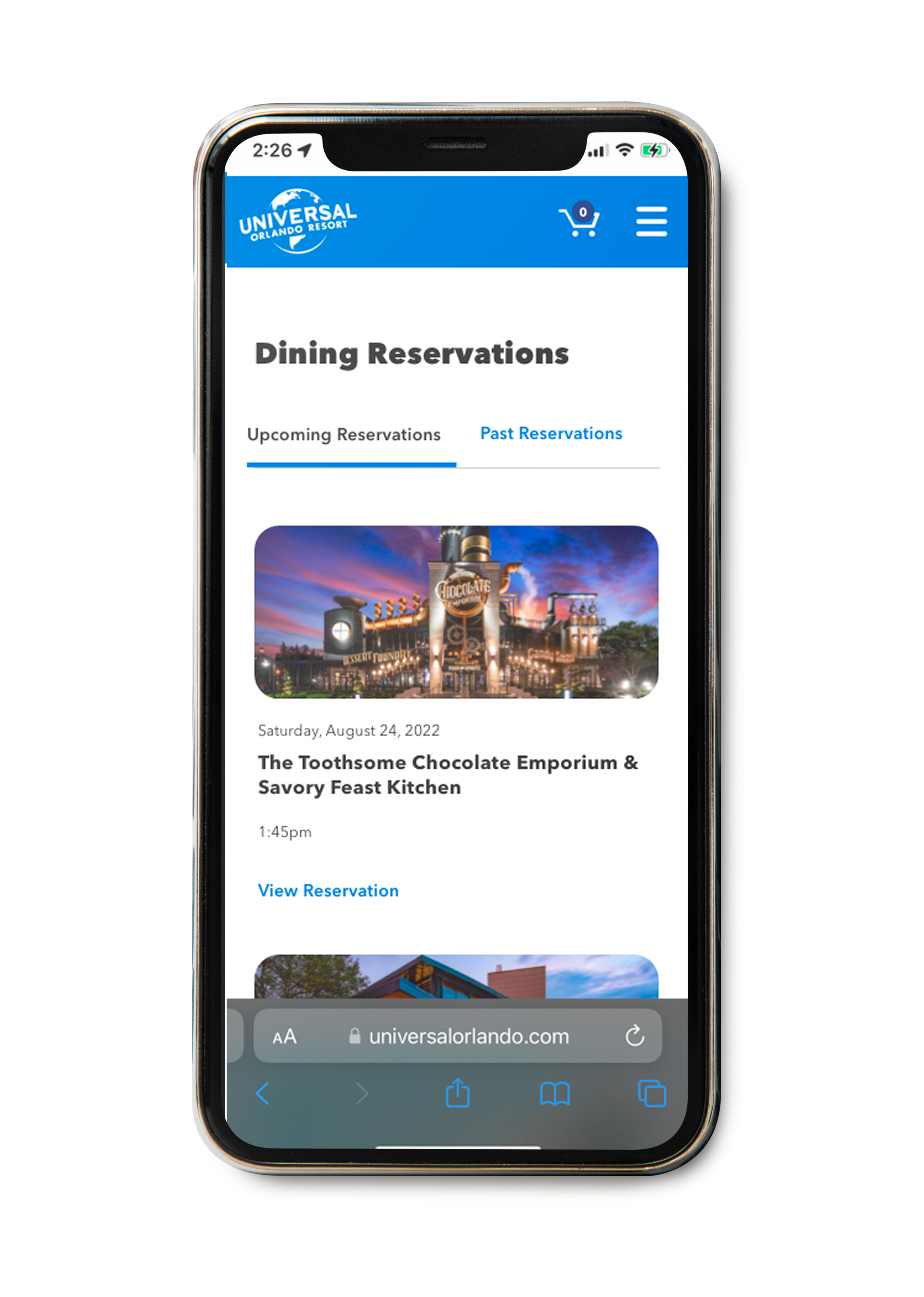
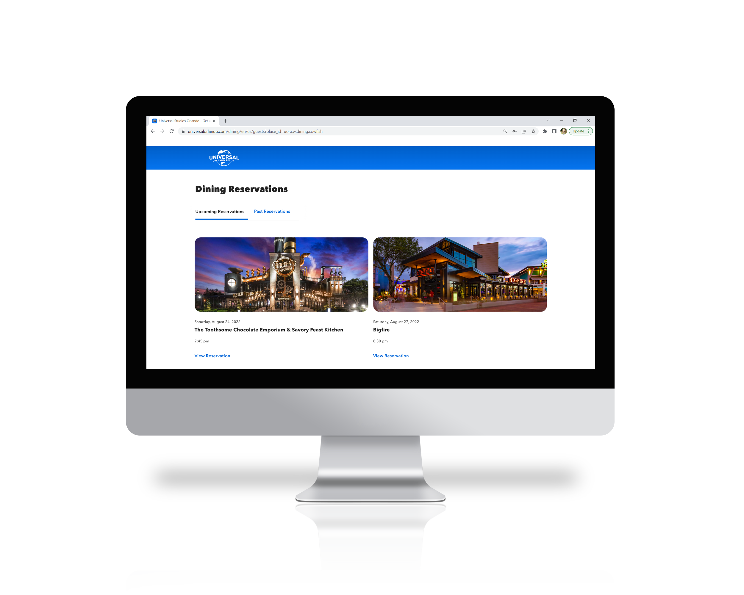
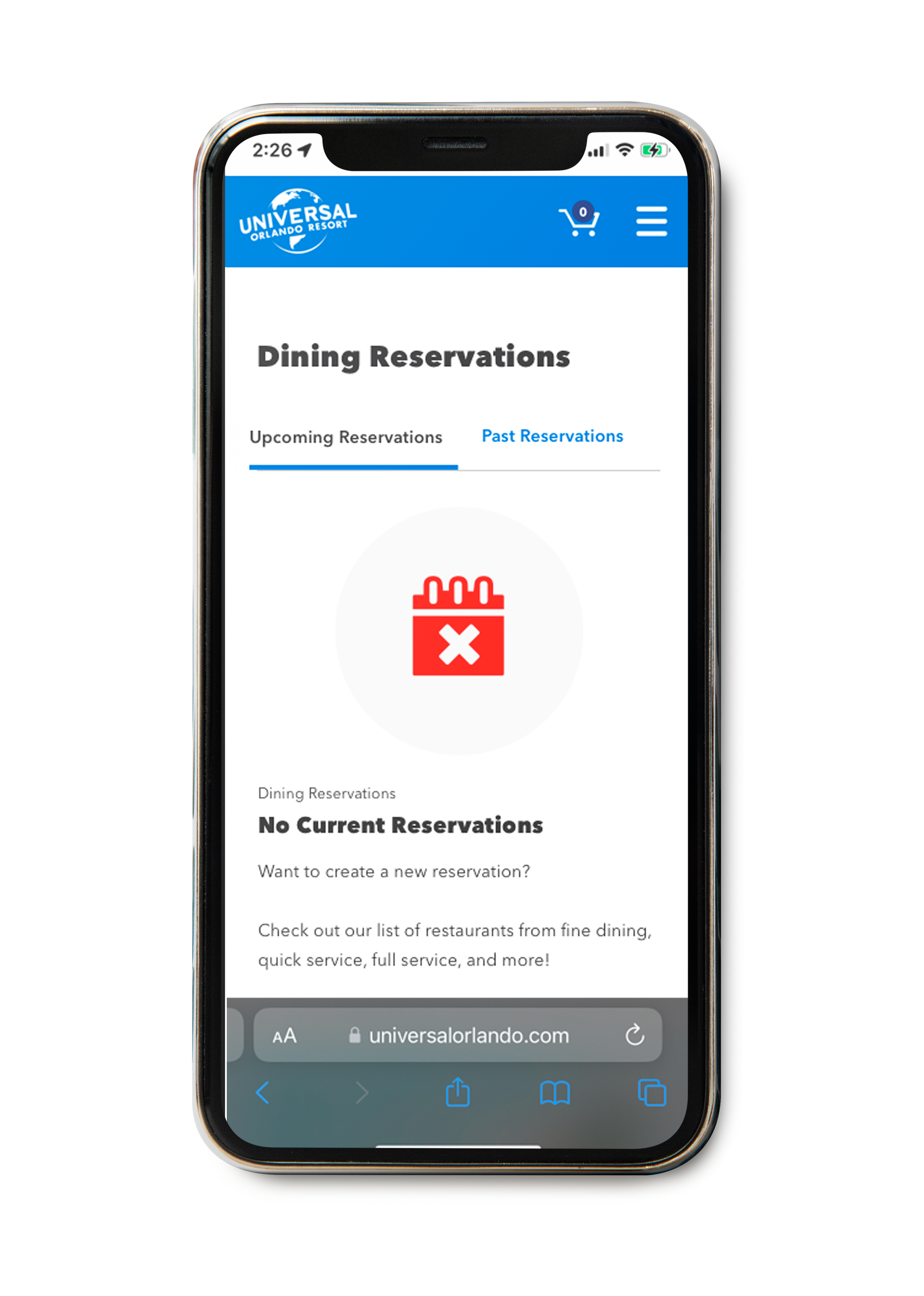
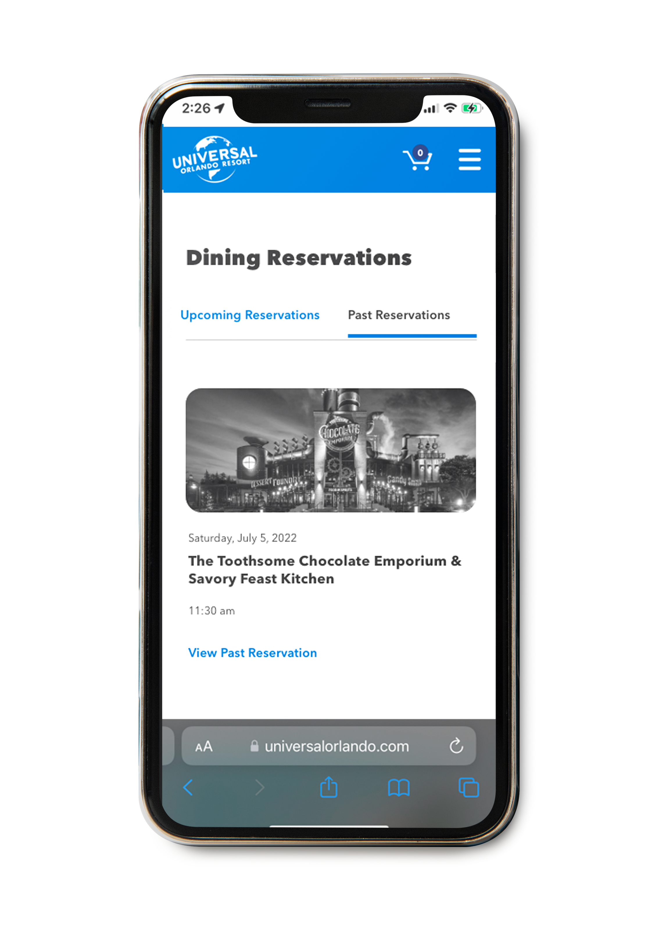
Reservation Dashboard
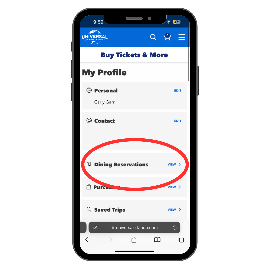
While the Guests are able to make a reservation without logging into their account, we still needed a solution for where the reservations of those who did log in would live. Within the app, this was added into the Users ‘Profile’ page. On web, the Dining Reservations tab was added into the users ‘Account’ page.
After visualizing and solving how the User would actually find these reservations, the next step was designing how these reservations would populate. While working within the constraints of our existing design system, I was able to begin solutioning some ideas.
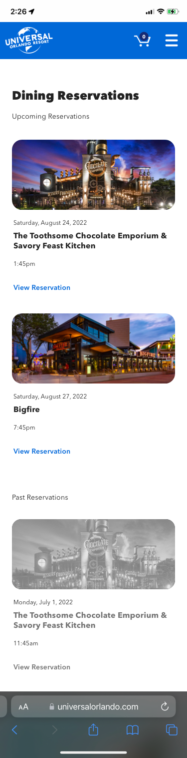
A few iterations with components and sketches later, round one of the dashboard came out. This was composed of a one-pager specifically marked with Upcoming/Past Reservations.
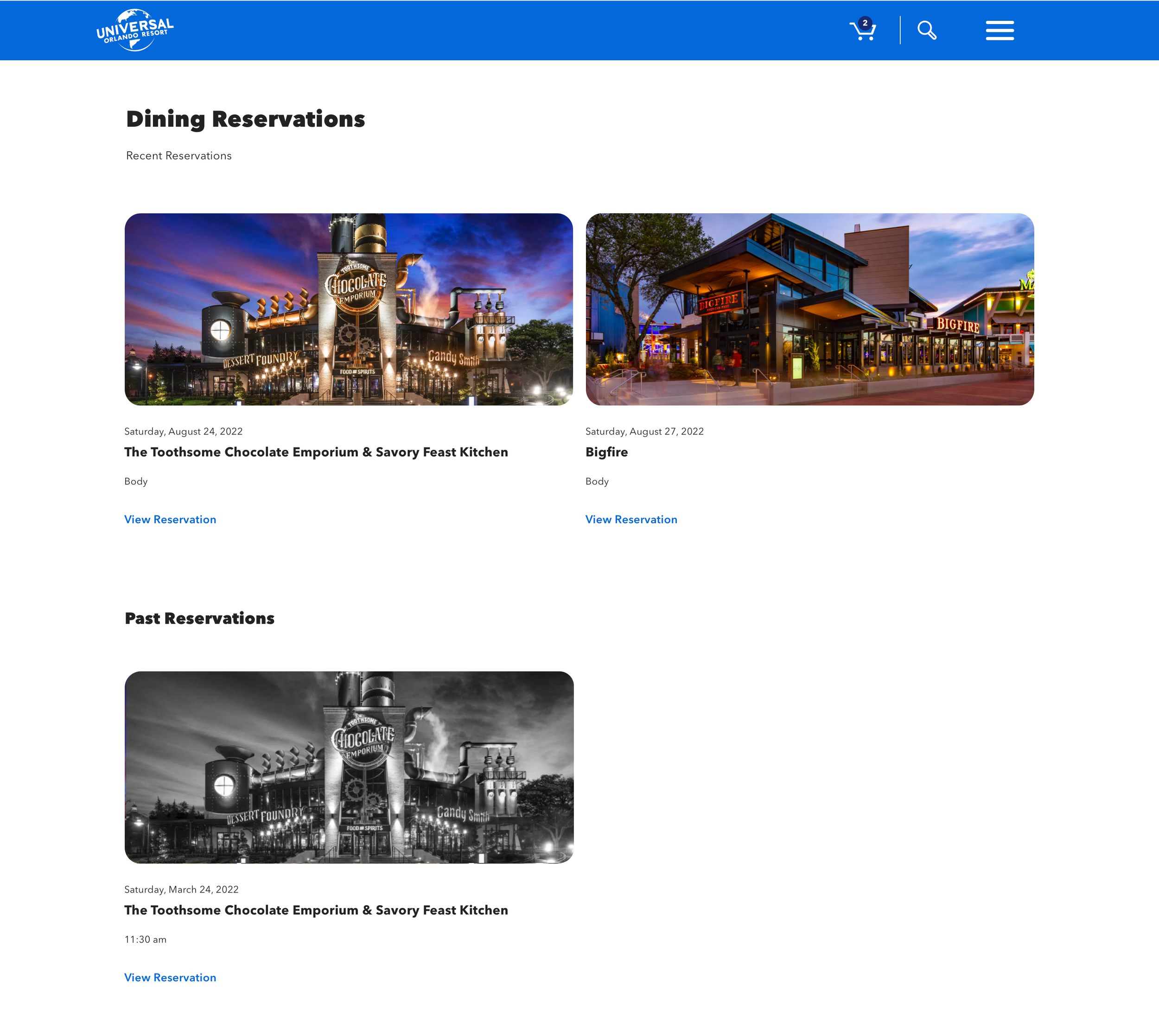
Some meetings and deliberation later, the full-page and ‘inactive’ look of the Past Reservation section just was not working. The solution was almost there, but needed a bit more shaping. I was able to input sticky navigations tabs as the best current solution to the dashboard view. Hopefully in the future there can be a different kind of dashboard created with new components, but I think it did a really nice job of solving the issue with the components that currently exist.
The idea was that the User could see all of their reservations that are upcoming, but the business also asked for the User to access past reservations. To accommodate for accessibility and reduce confusion, I made the ‘Past Reservation’ section gray scaled.
In addition to the sticky navigation tabs, I made the Past Reservation section image as black and white as opposed to the ‘inactive’ look that the component was portraying as a whole before. This helped to convey to our User that while this reservation is old, they can still click on it and view the reservation details if they’d like.
Mobile Dashboard:

Desktop Dashboard:
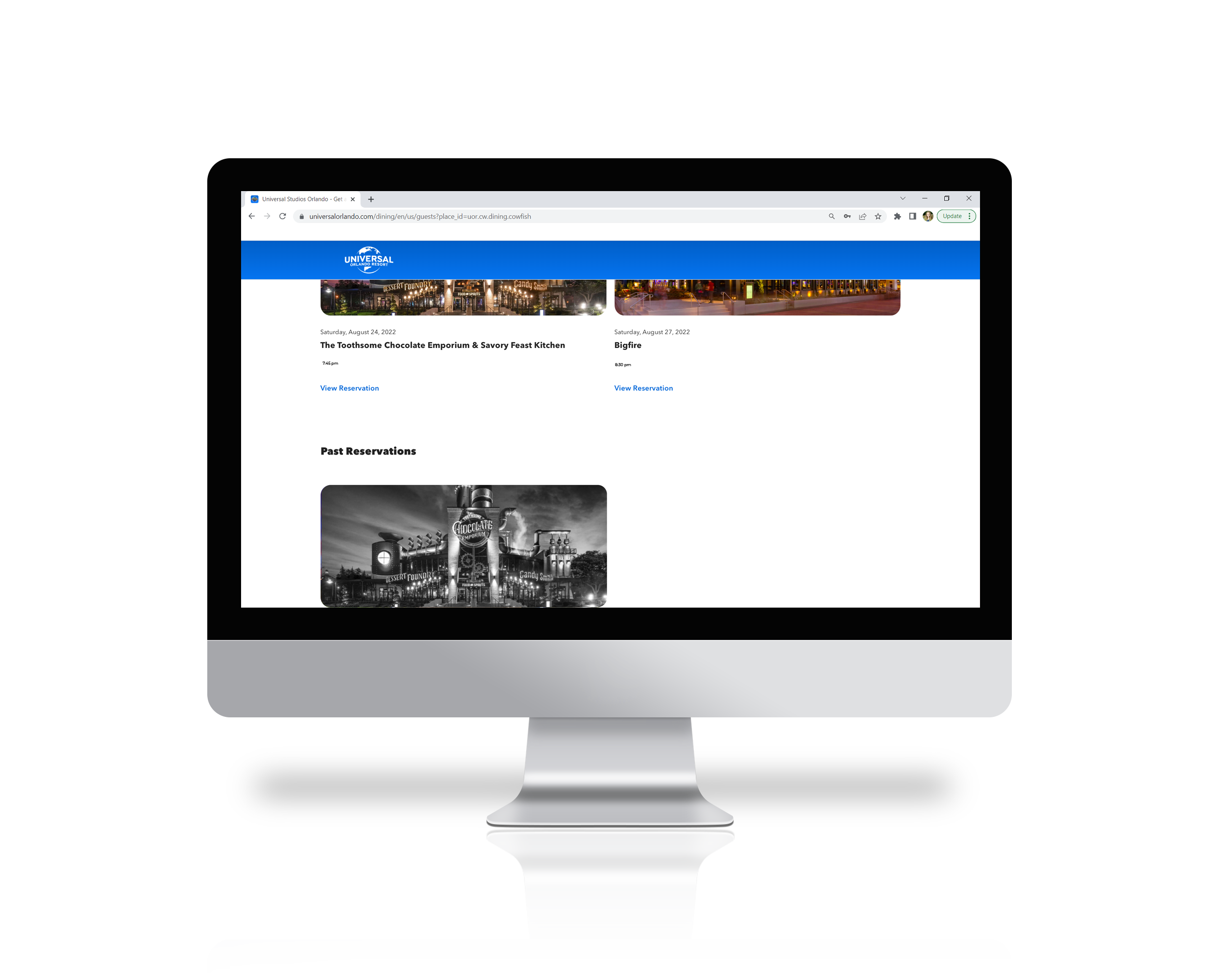
Additional Designs of Finalized Dashboard:

Prototype and Final Designs
View Mobile Prototype:
Mobile/App Final Designs
View Desktop Prototype:
Desktop Final Designs
Designing within the constraints of our design system, as well as a web-based Product vs. in app definitely added a level of complexity, but it allowed me to think outside the box of how to approach the product. While a Product may be live, it’s never truly complete, and I’ll be excited to keep making improvements as we get more in-park feedback regarding the reservation system.
Being able to utilize our design system for this entire project was a win, and only helped to aid in keeping the brand strong and consistent throughout all of Universal’s Digital Products.
In Conclusion...

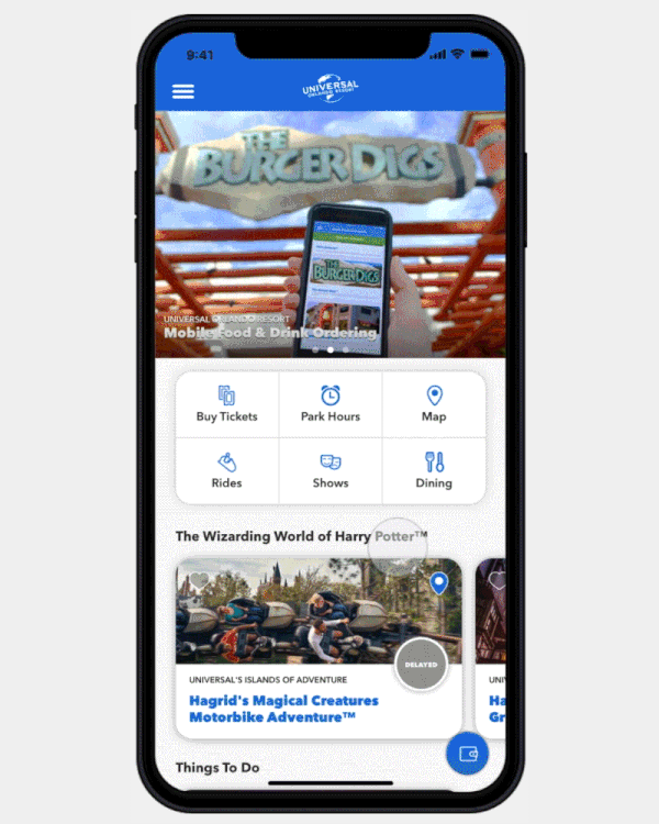
Check out the Dining Reservation app being used in action at the Parks!
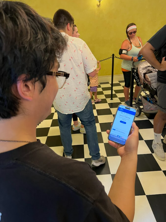
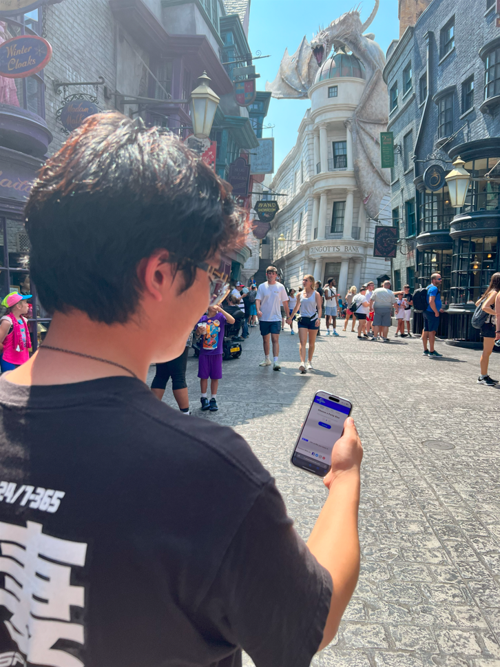
See the Live Dining Reservation Product for yourself here🍟 :
Promo Video: Coming Soon!
So, where are we booking our next Universal Dining Reservation? I say we go to the Hard Rock Cafe!
I mean…look at that burger! 🍔
