

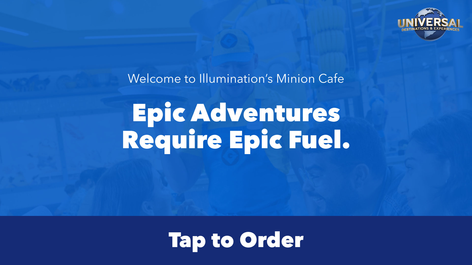
Food & Beverage Ordering Kiosks
🌎 Universal Destinations & Experiences
Universal Parks needed an alternative ordering food ordering option beyond the Mobile App, and in-park kiosks became the solution. Our objective was to mirror the familiar structure of the existing App ordering system while leveraging our Global Design System, ultimately delivering a more seamless and elevated experience.
All content shown is copyrighted and owned by Universal Destinations & Experiences and shown solely to demonstrate the work I produced as a Sr. Lead Global Product Designer.*
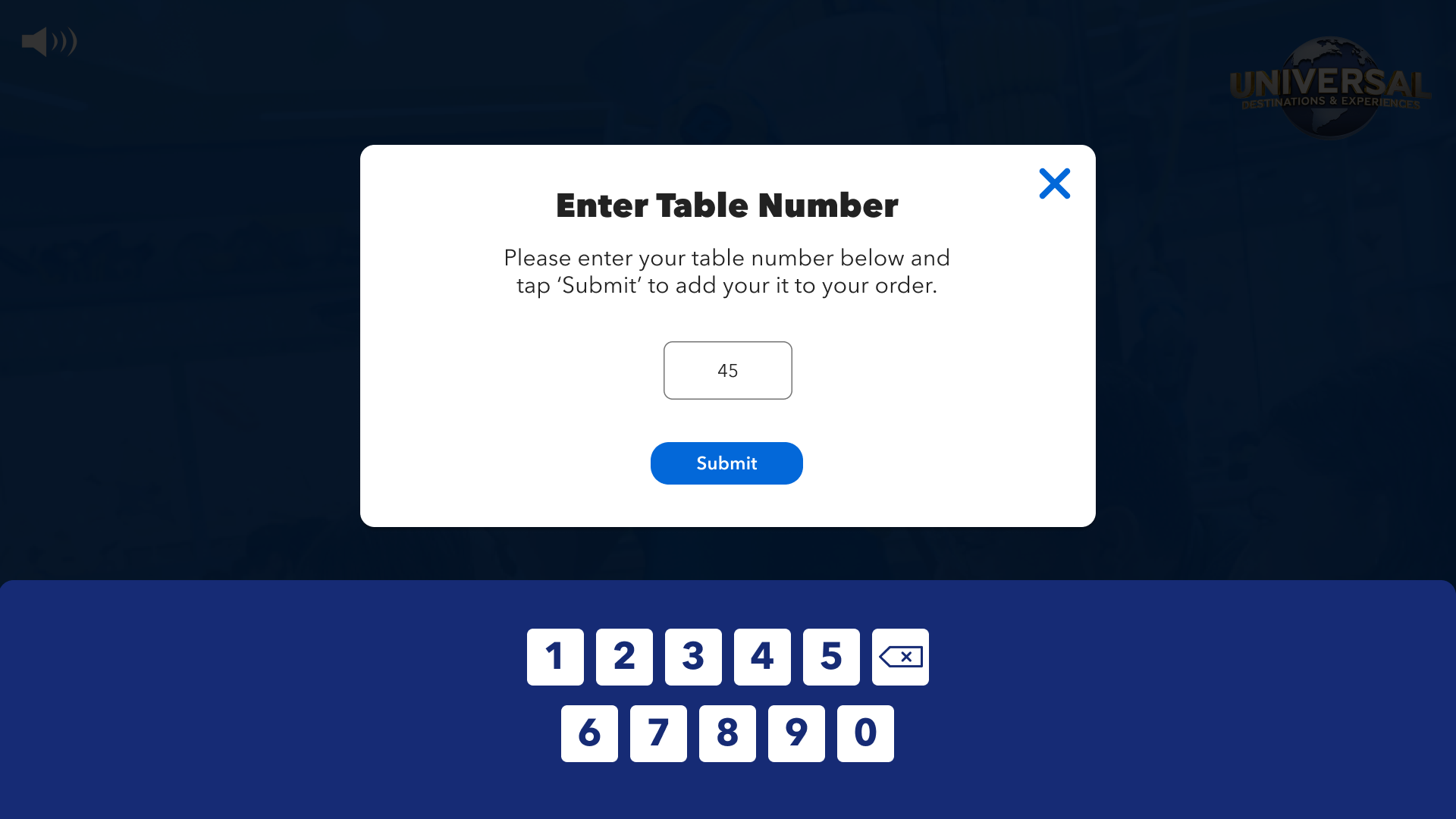
Not Everyone Has or Wants to Use a Cell Phone To Order Food - Give Other Options
THE PROBLEM
Not every Guest has a smartphone, nor wants to use one to order food, so we needed to give them another option to order food.
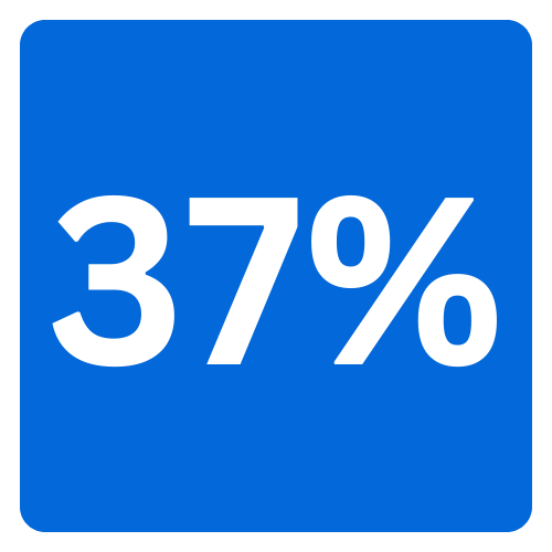
With the successful implementation of my F&B Kiosks UX work, Food & Beverage sales increase by 25% in one month with Kiosk usage, and due to my components of the ‘upsell’ items, sold 37% more upsells than recorded in the past 3 months on the Mobile App.
MY IMPACT
F&B sales increase in one month.
more upsells in 3 months than App

Due to major timeline impacts, I had one short month and a half to research, design, test, and deliver this Product. On top, I had to ensure it matched our existing App functionality, and fit into our Global Design System ecosystem.
UNDERSTANDING PRODUCT REQUIREMENTS
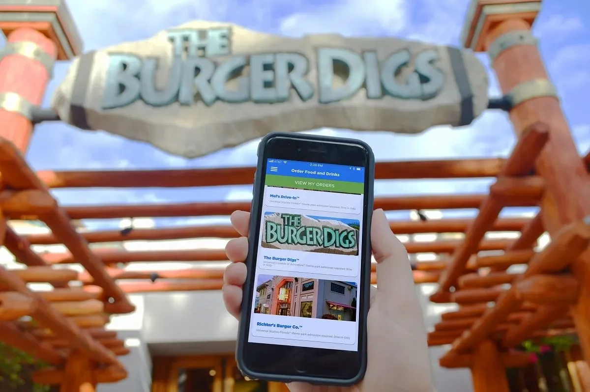
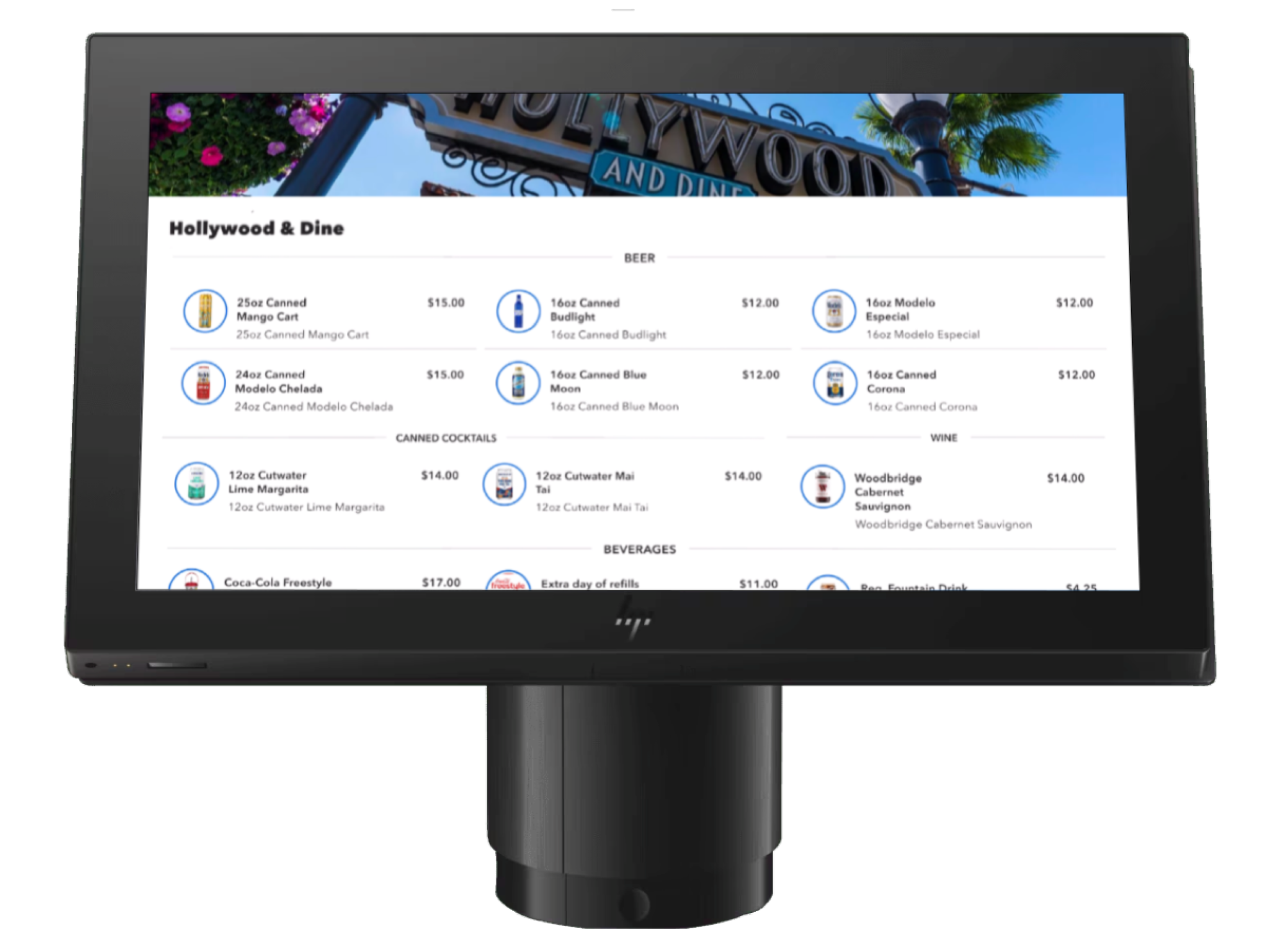
Existing Mobile App Ordering Designs/Flow (Not Designed By Me):

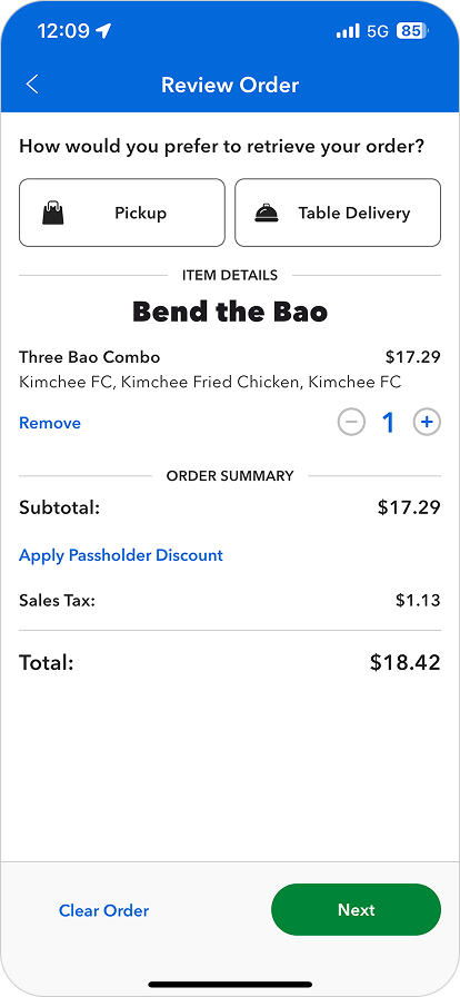

I was essentially asked to ‘take the Mobile App and plop it in a Kiosk formatting’.
PRODUCT ASK OF UXUI:
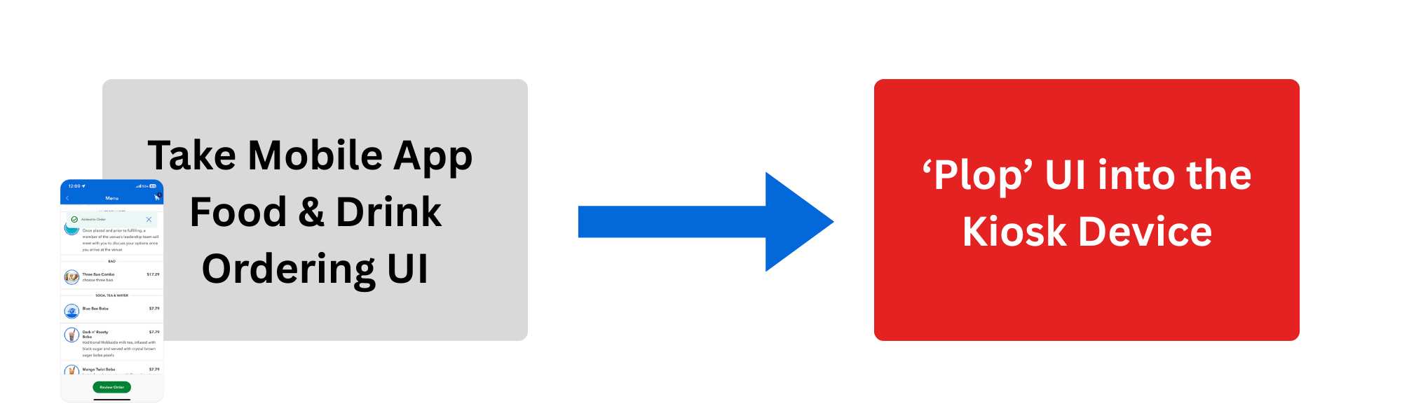
But, there were a few problems with that…

1. Guests had a lot of negative feedback on the existing Mobile Food & Drink Ordering Flow in the App. I didn’t want to recreate something on a new Product that wasn’t even working in the present.
2. You can’t successfully translate a Product designed for an App, simply plop UI it into a different Product and expect a good User Experience with no major adjustments needed.
FIGHTING FOR OUR USER
In this particular project, I found myself pairing with our Development team to push back and fight for our User before the work truly began. We were met with a lot of pushback from our stakeholders and Product as they did not want to change the original goal of implementing Mobile App UI. I went into research mode and our Developers dove into the code.
I pulled internal data from our Analytics platform that came from real-life user feedback about our existing Mobile Food & Drink Ordering in the App.
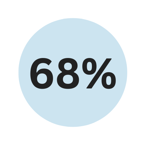
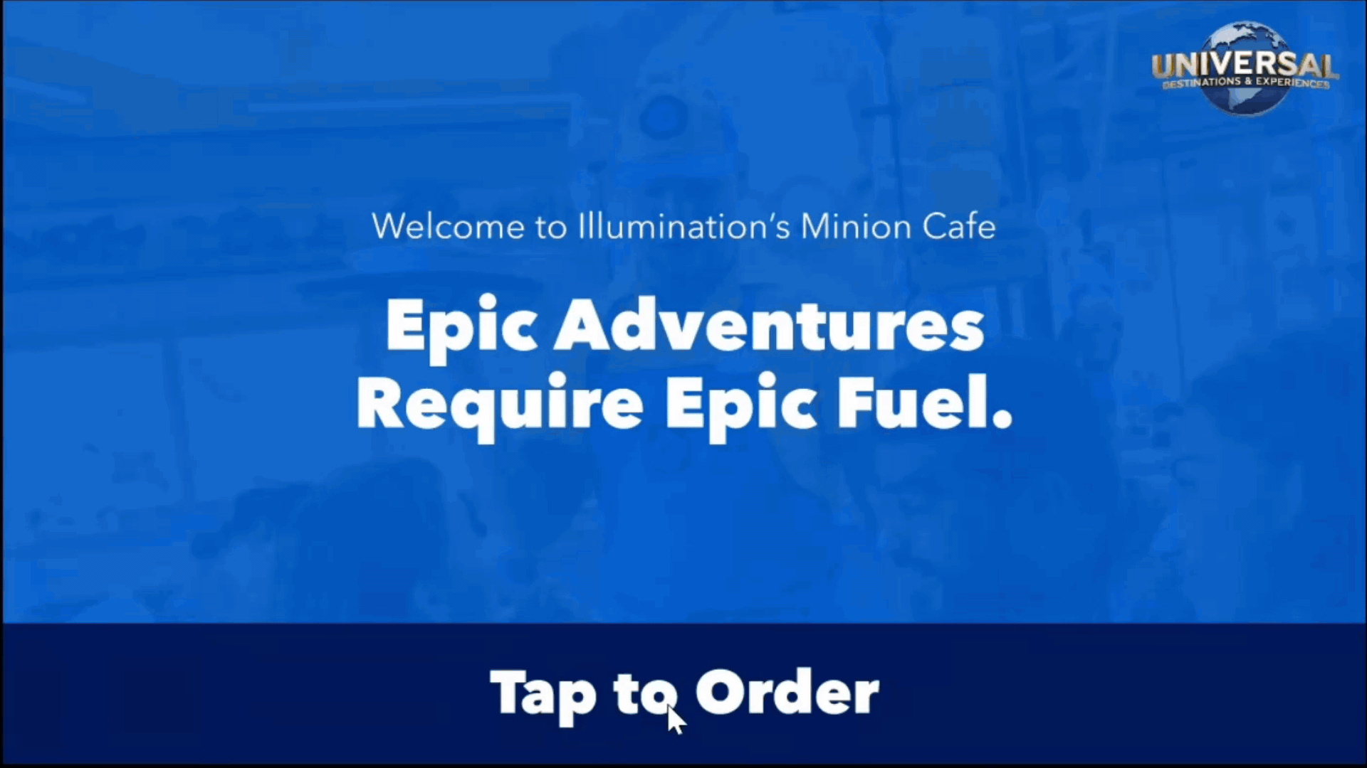
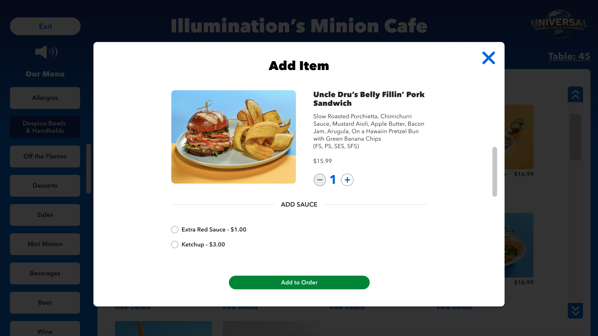
of users reported imagery was too small, they couldn’t see the full menu clearly.
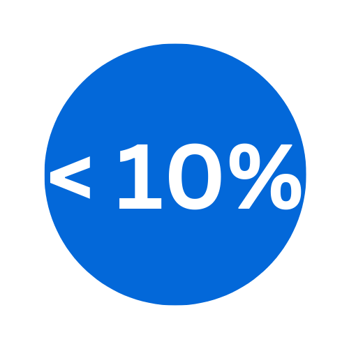
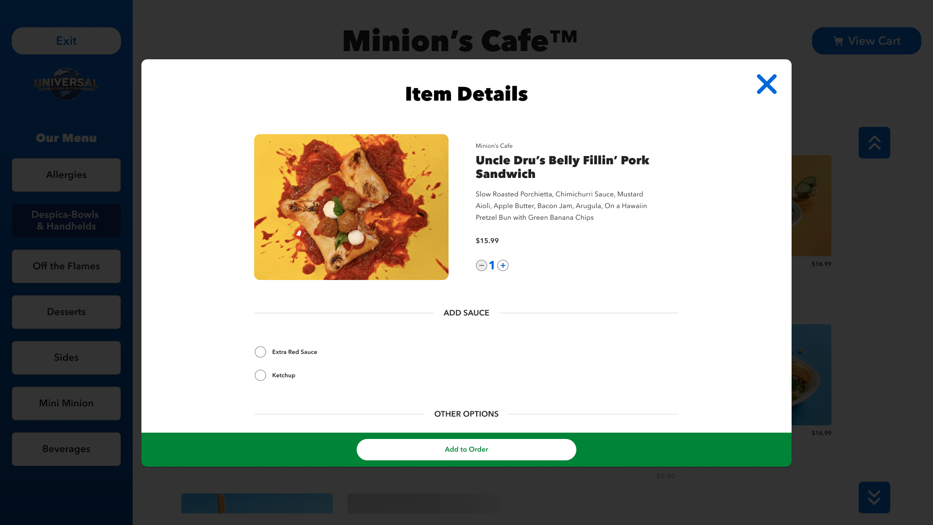
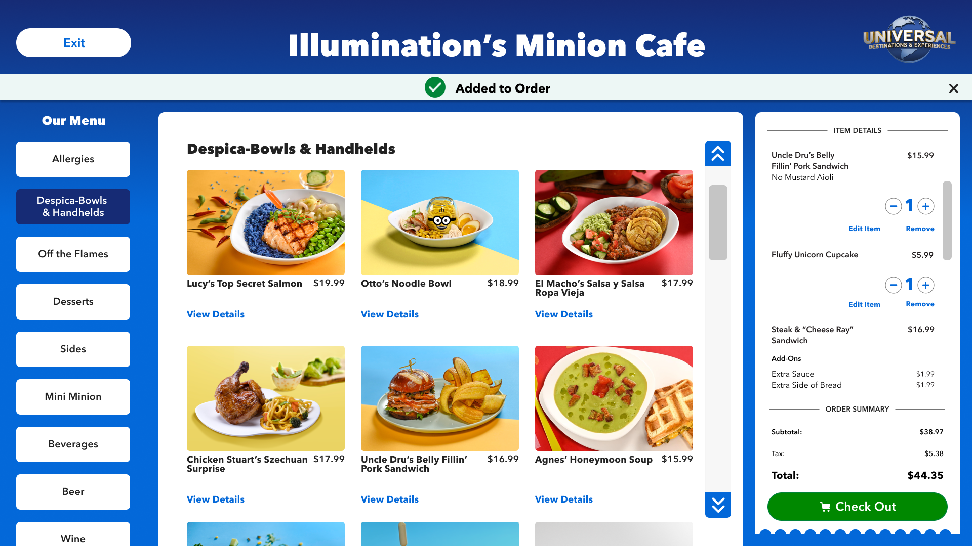
less than 10% of users were actually using the ‘upsell’ feature to buy more.

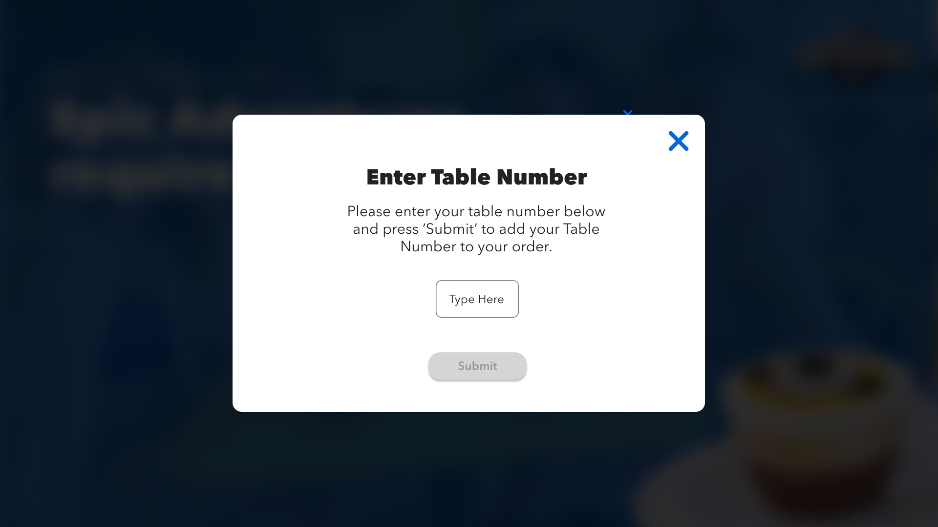
of users struggled to clearly checkout and add their table number to their order.
I conducted research on what other companies using Ordering Kiosks are doing and why it works.
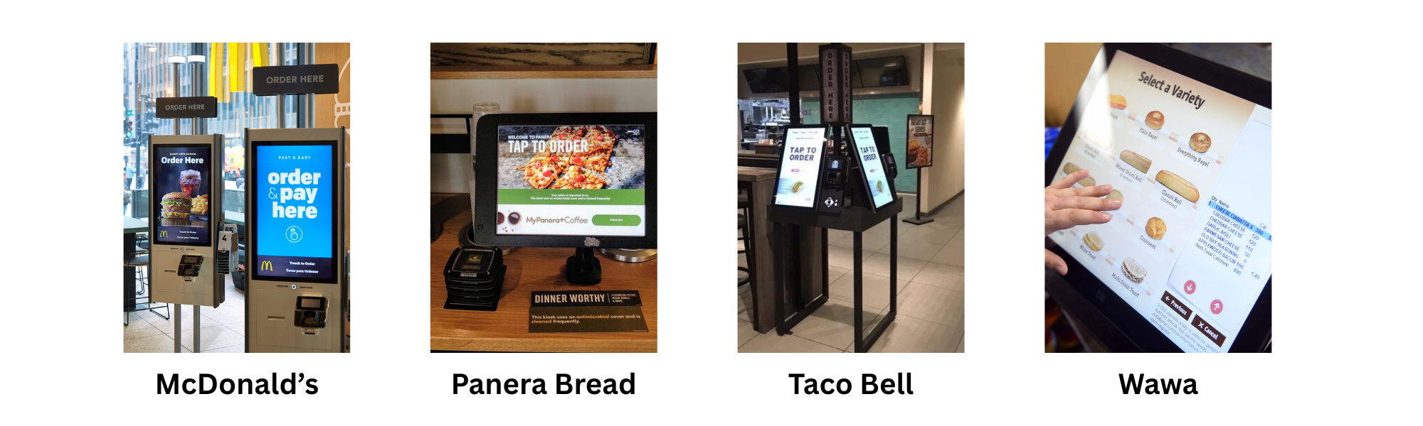
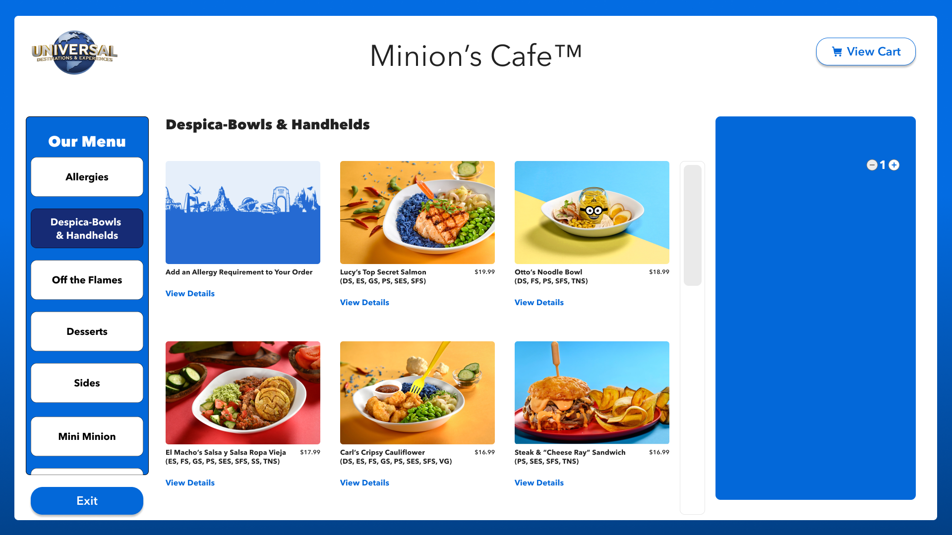
I found people need to see pictures of food, they like BIG elements on larger screens, and clear, concise processes. All of which translating the Mobile App 1:1 would not deliver.

Harvard University research studies found that 62% of consumers were more likely to buy something if they see a picture. I used this information to fuel my designs and conversations with Product and stakeholders.
Hypothesis: Larger/Better Food images = More Sales
I showed them a real-life version of what they were asking for.
One strategy I take when I am getting pushback is to show stakeholders exactly what they say they ‘want’. It helps to paint the picture of why I was saying it’s not a great experience. I used this as my starting point of changing the narrative of the design, but also ensure I was compromising based off of Product requirements.
I started out with similar variations that matched the app, to try and bring elements of existing functionality that did work in order to compromise with stakeholders. I also ensured that I was designing to fit naturally into the ecosystem of Universal Destinations & Experiences, and could expand throughout all of the parks and restaurants. As it progressed, I started slowly modifying smaller things to improve the UX. Given time constraints, I jumped straight into high-fidelity.
DIVING INTO DESIGN
Beginning Designs (Putting Pen to Paper):

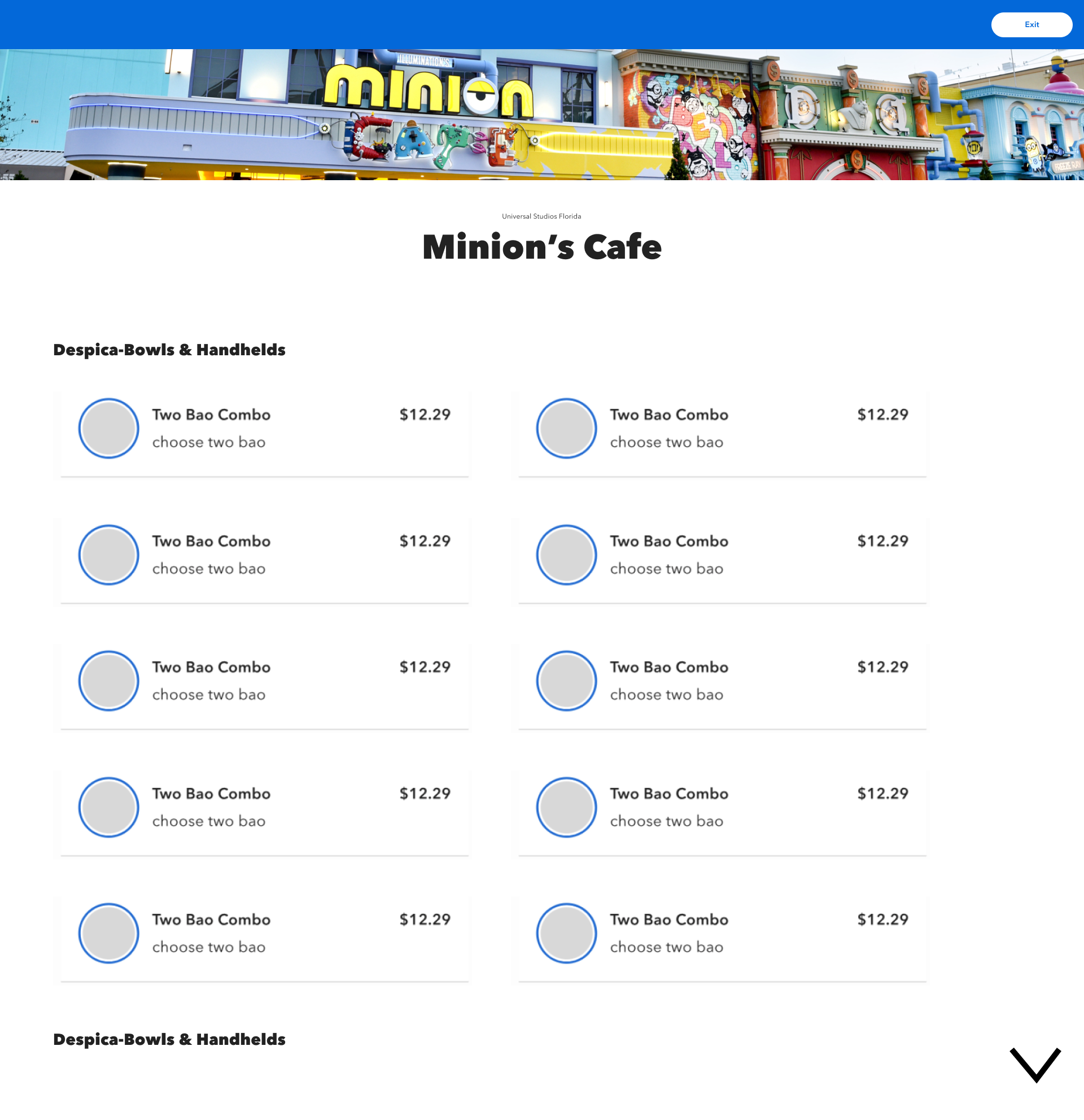


Iterating & Enhancing
I only had a short window to get this work done, and I wanted to ensure I had time to test. So I kept iterating through variations until I to a place where I felt ready to test. I worked on adding components in as well that were reusable.


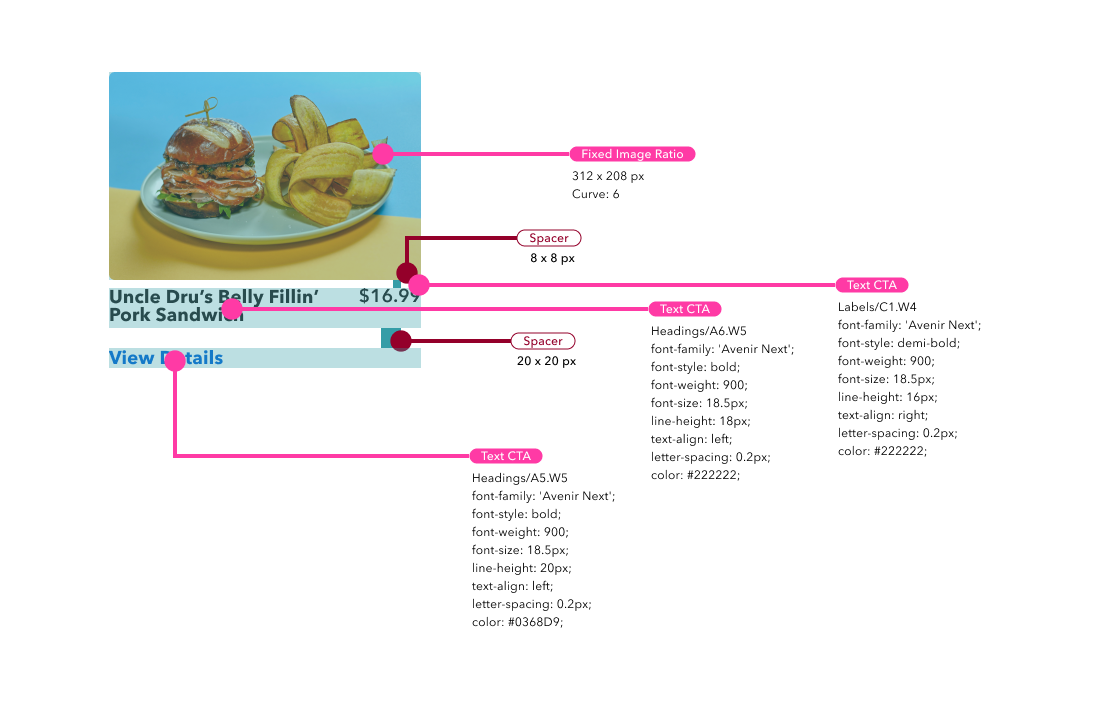
Adding new reusable components based off existing Universal Global Design System.


Now Let’s See If This Works…
USABILITY TESTING
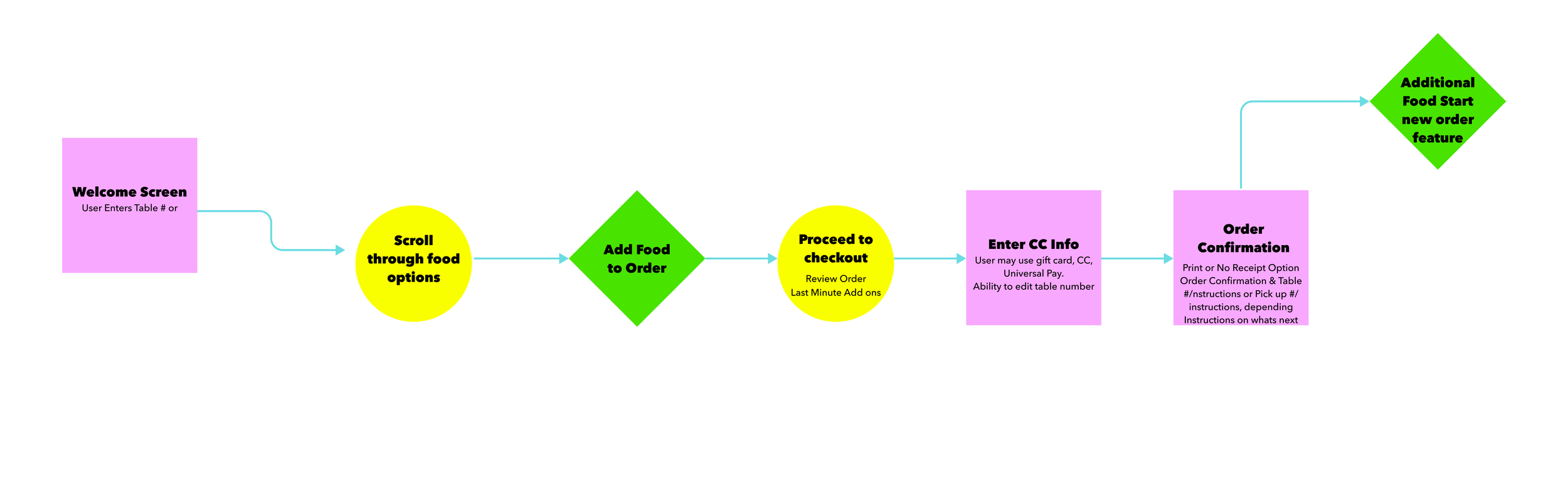
A Product is only as good as it tests. I set up my test with around 5-6 tasks for our users to test both moderated and unmoderated. I set up the tasks within Figma, including the Prototypes for our users to use during the tests. I set a few objectives, and general questions I wanted to understand most from our users.
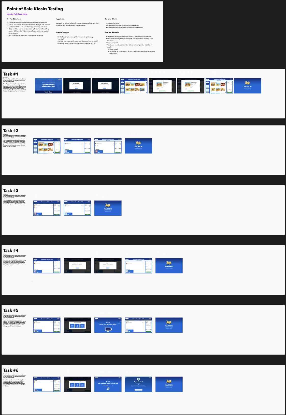

User Testing Task #1
Task Example:
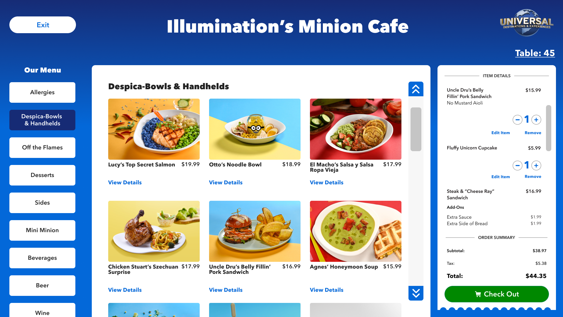
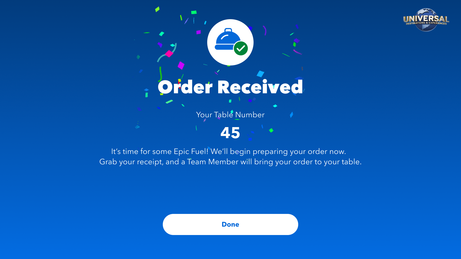
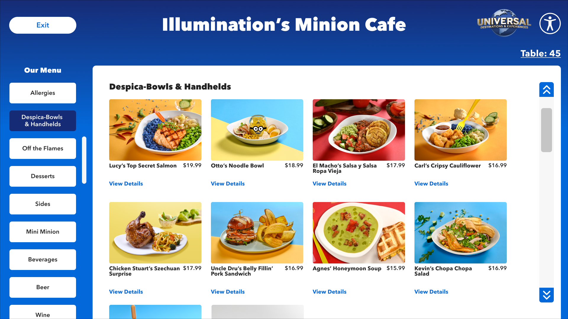
You are ready to order an item from the Kiosk. Begin your order. Enter your table number and browse the menu. You decide to add two ‘Uncle Dru’s Belly Fillin’ Pork Sandwiches’ to your order. Add this item to your order. You will know you have completed this task when you see a ‘You Did It!’ screen.
Over the 6 tasks, the result highlights were as follows:


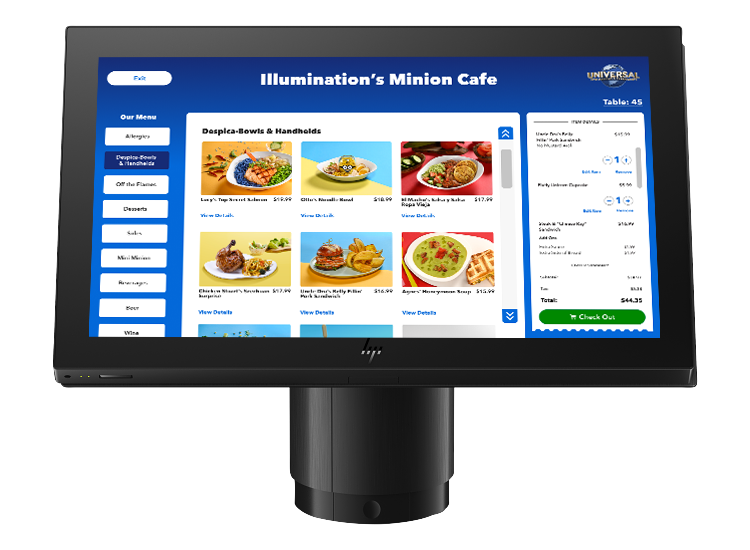
FINAL DESIGNS + CREATING A PRODUCT THAT SCALES
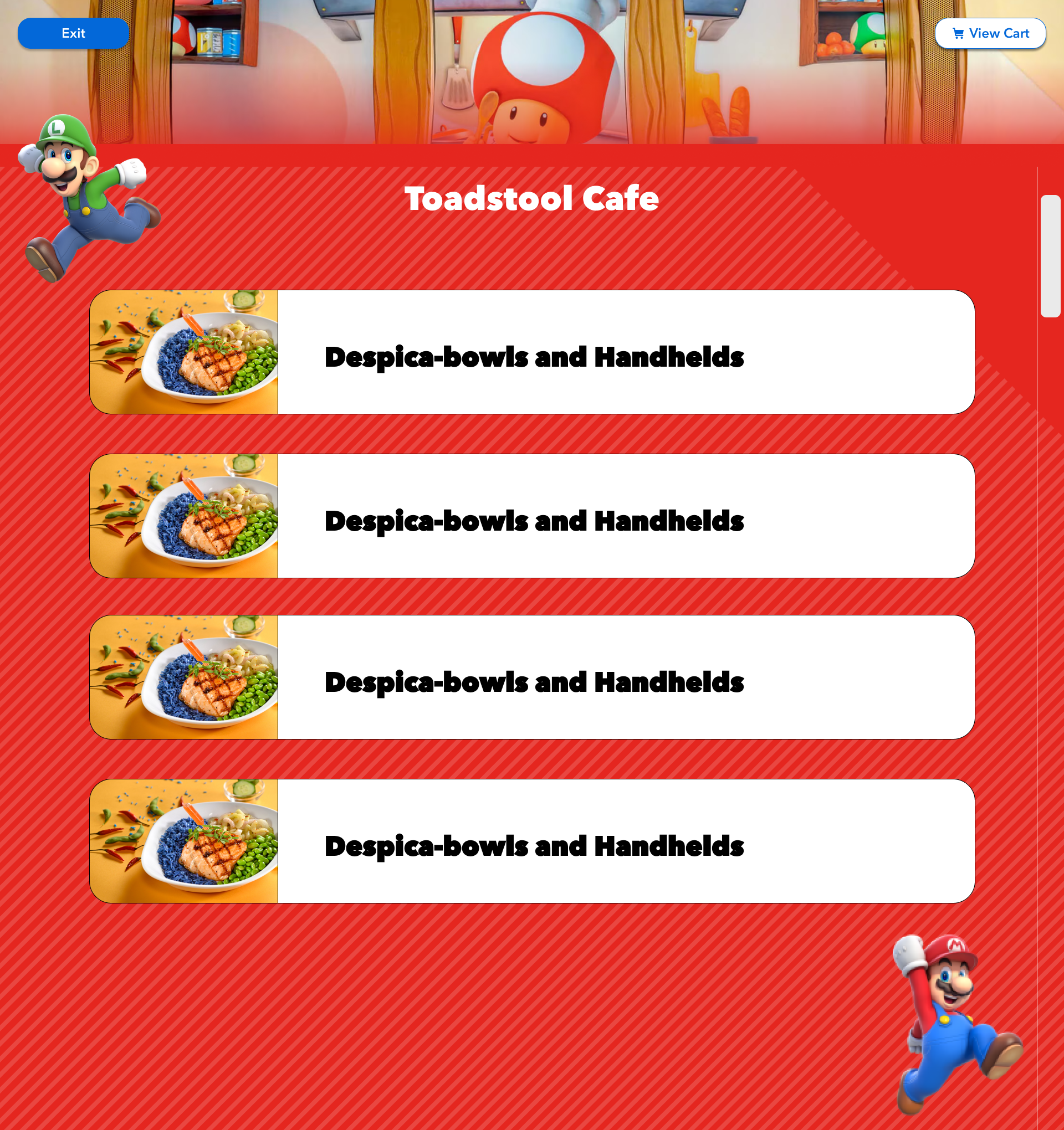
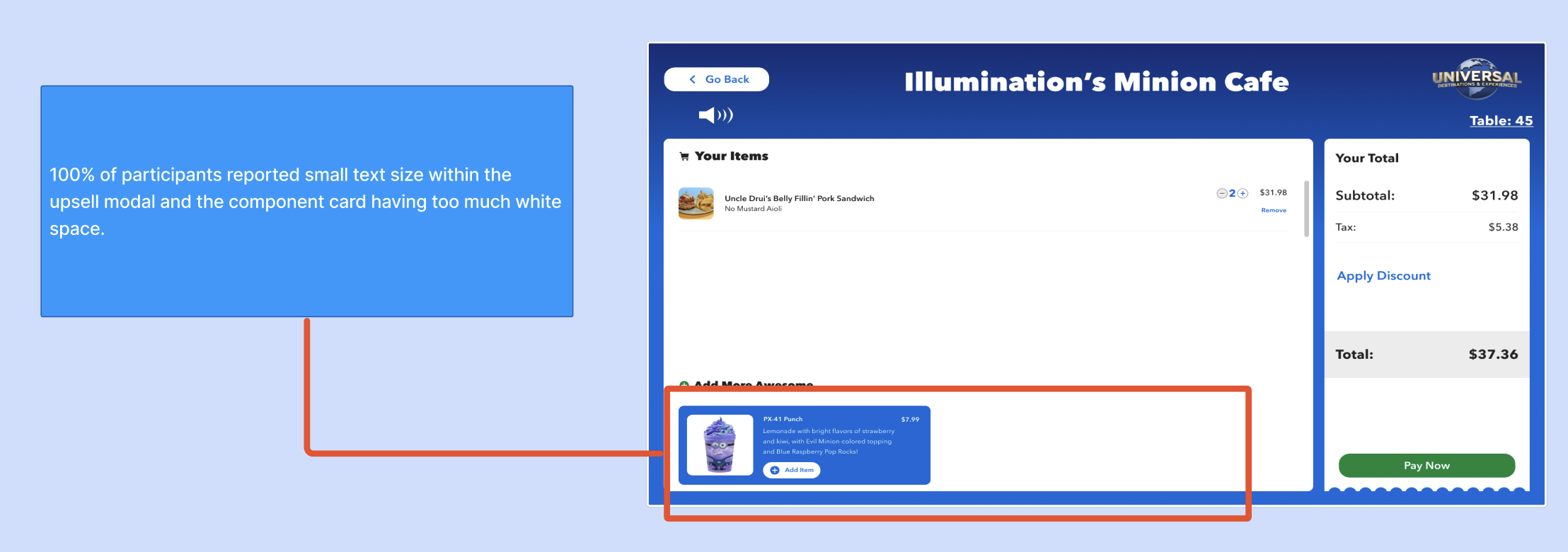
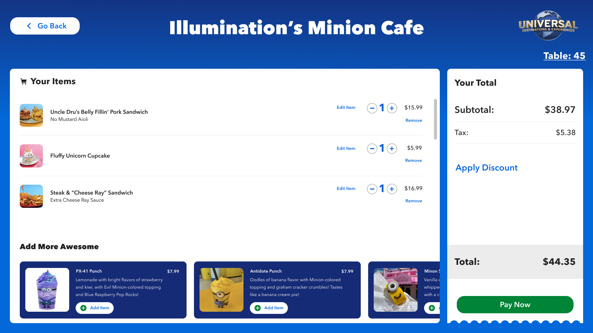
I took the great feedback about the upsells and kept iterating until it tested accordingly. I took existing functionality from our Design System, and ensured I designed something more ‘general’ that can be used in all different parts of Universal. From themed areas to City Walk and beyond - a product that can scale across different kinds of venues, but then also a product that can also be easily themed in the future but still fit into the same ecosystem.


Ensuring A Product Inclusive For All.
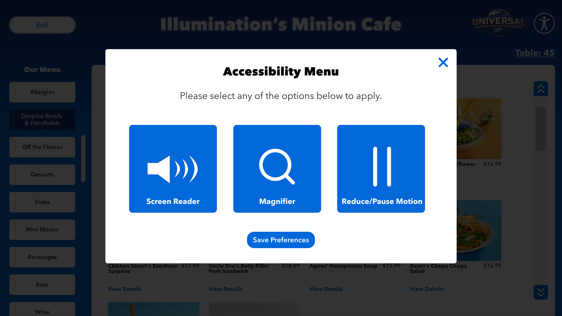
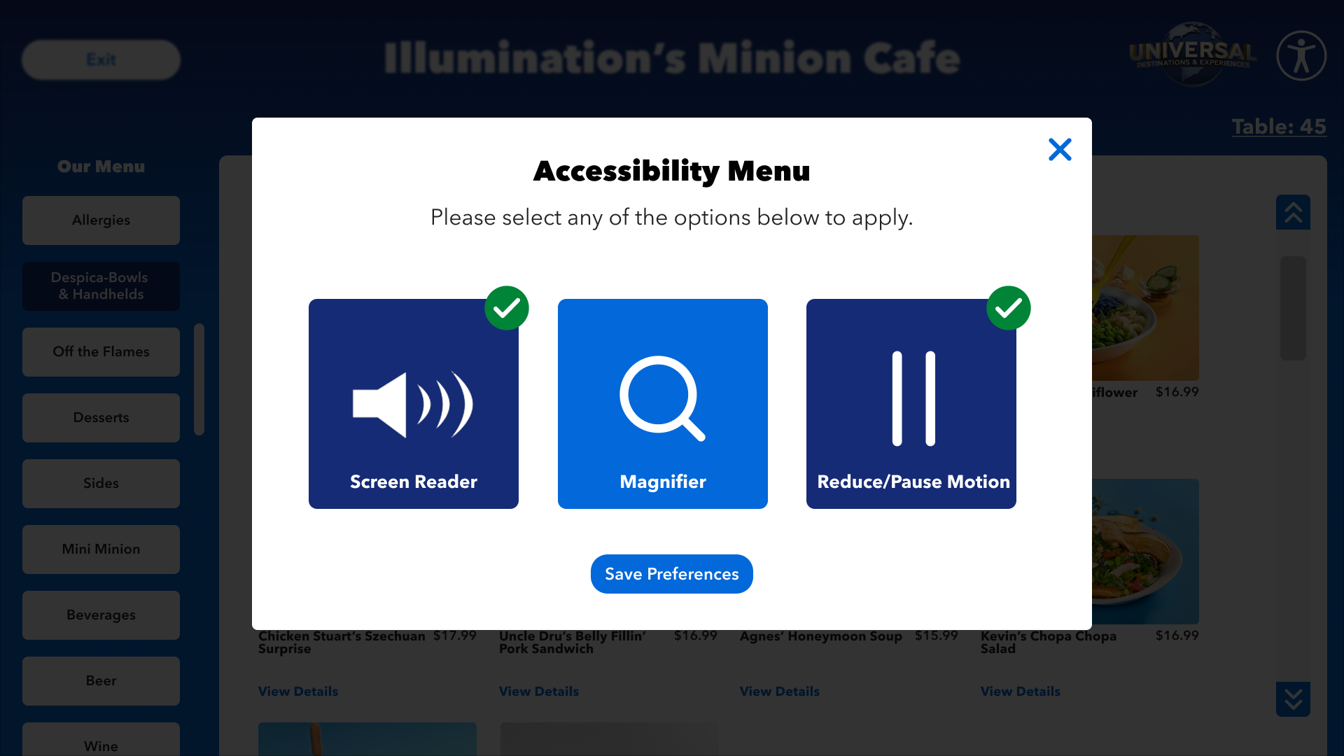
ACCESSIBILITY
Accessibility was on the top of my mind during the design of this whole Product. From colors, to icons, to size. But once the foundation of the project was laid, I went back and found a neutral location to add in our accessibility menu so it is always present. When active, it was have a green checkmark to show enable features. A new feature we just added was the screen can split lower for our wheelchair users.


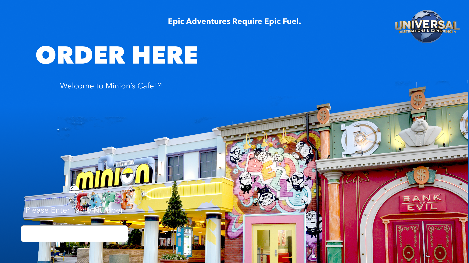
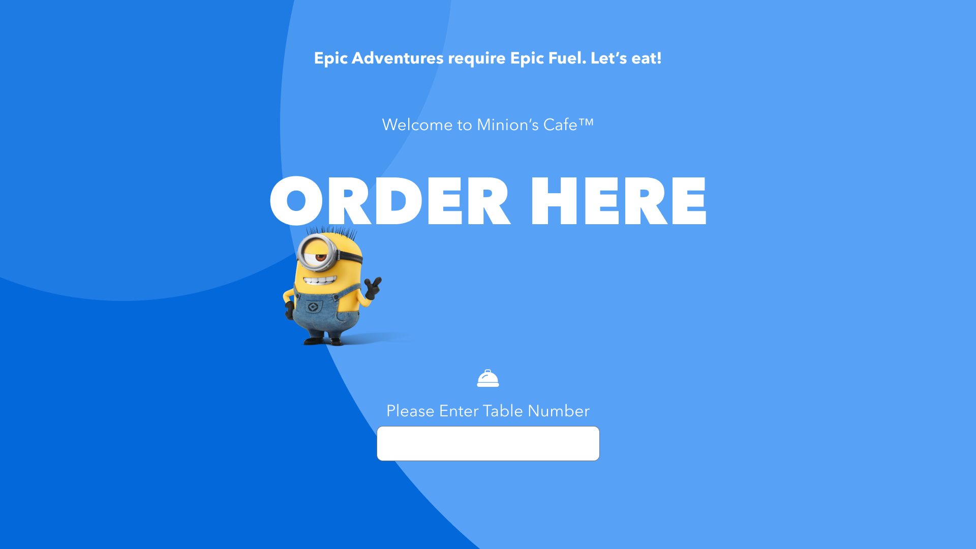
IN PRODUCTION + ON THE INTERNET
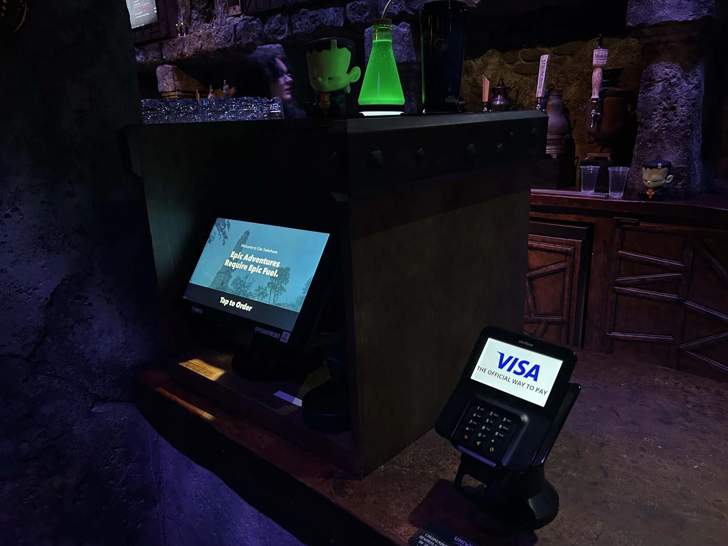
The Product launch was successful, and is being used by Guests in the park at Universal Epic Universe, and soon to come to the other parks.

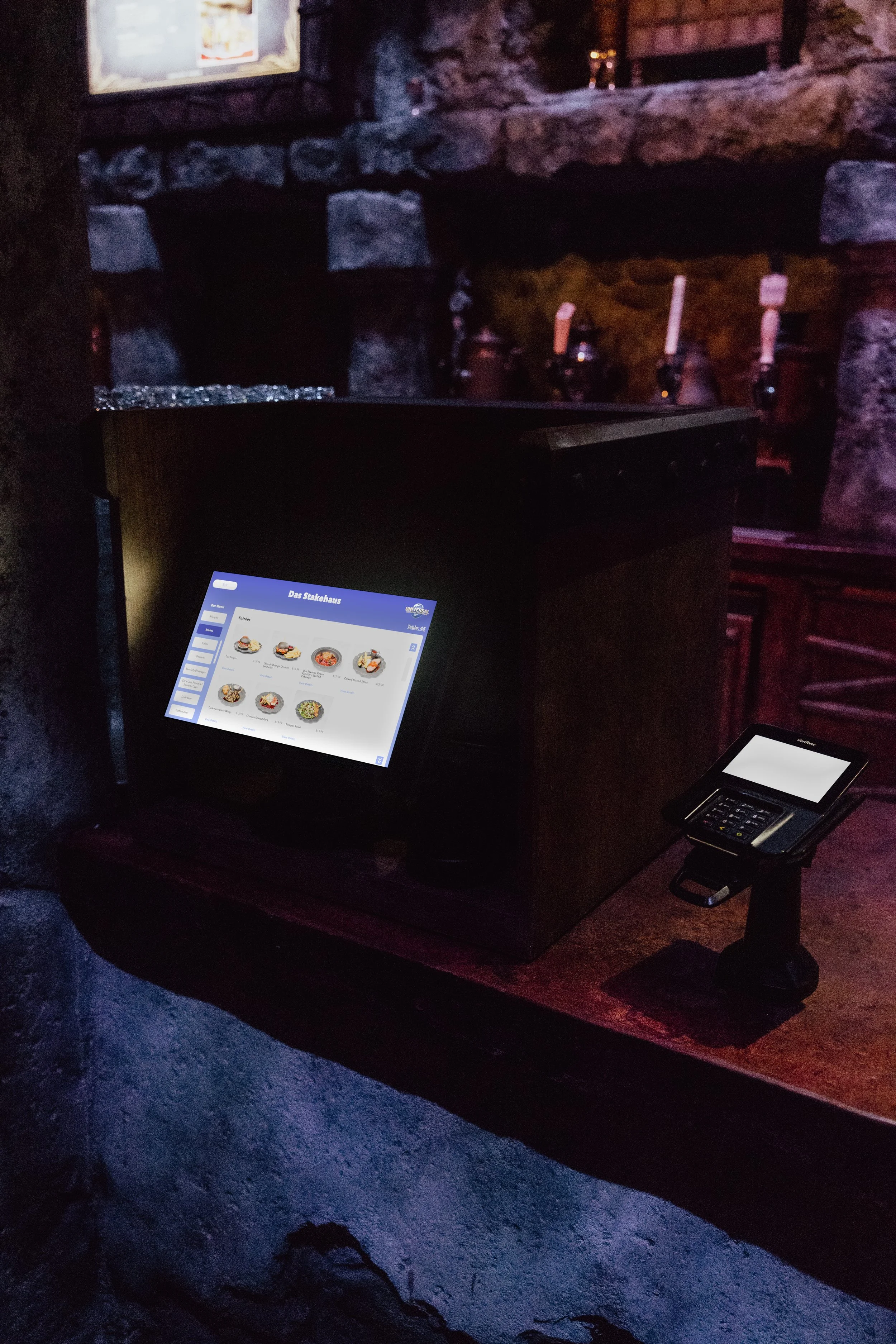

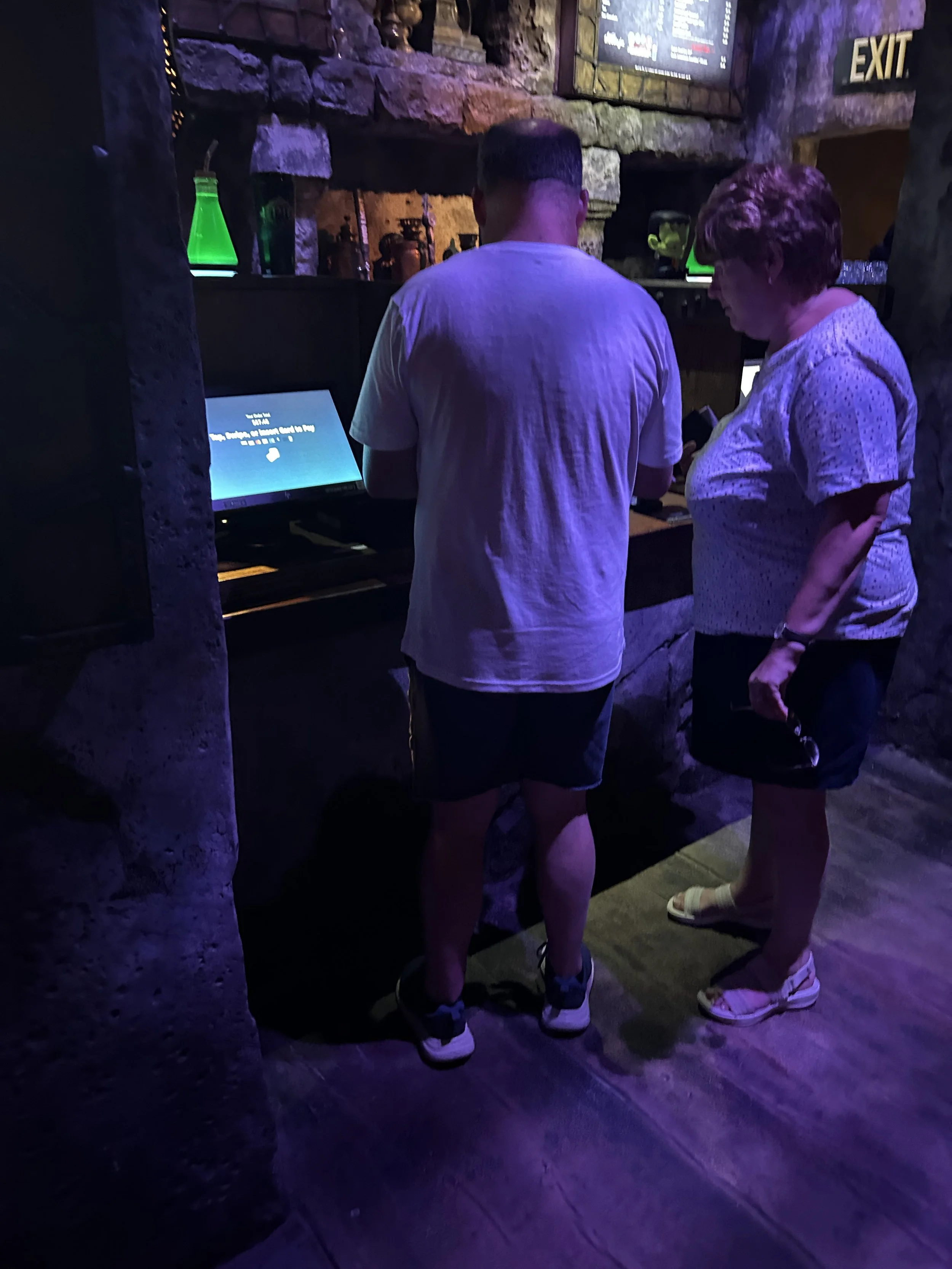
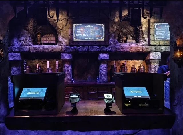
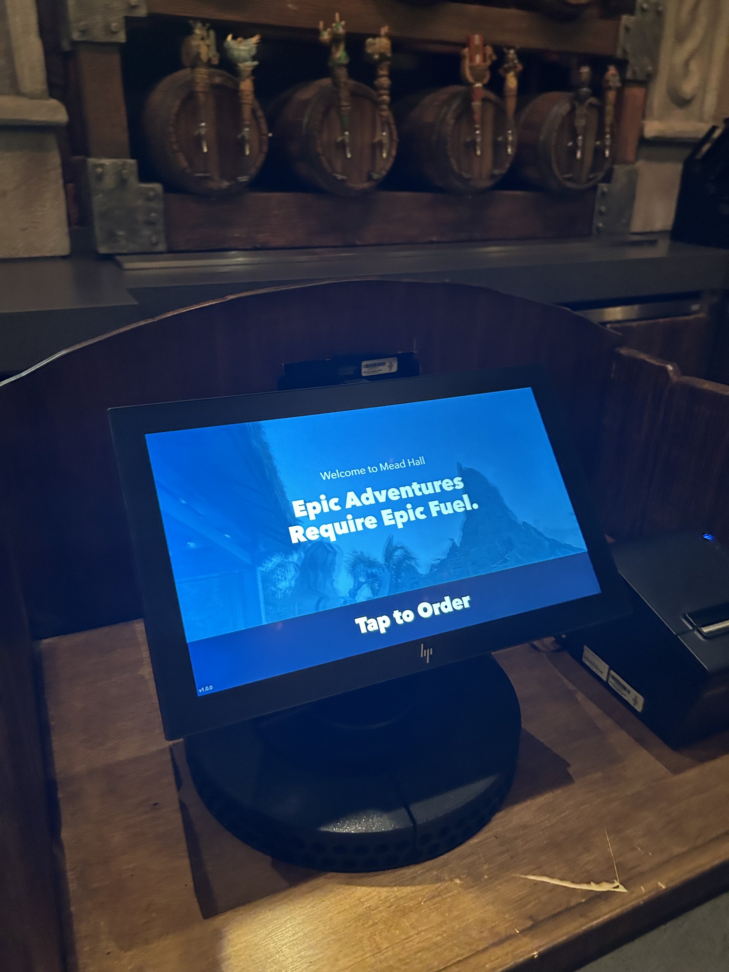
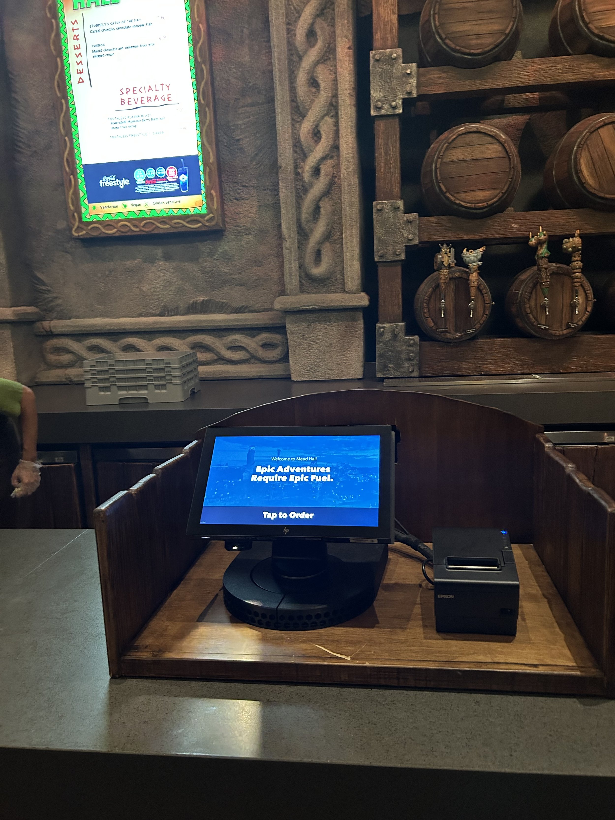
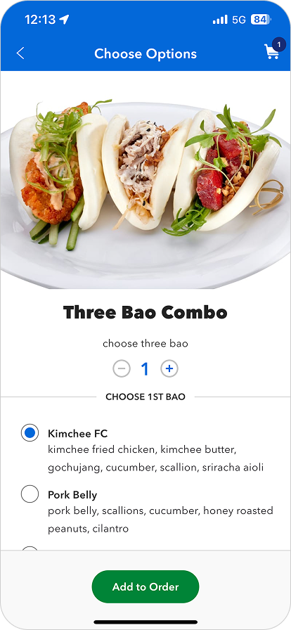
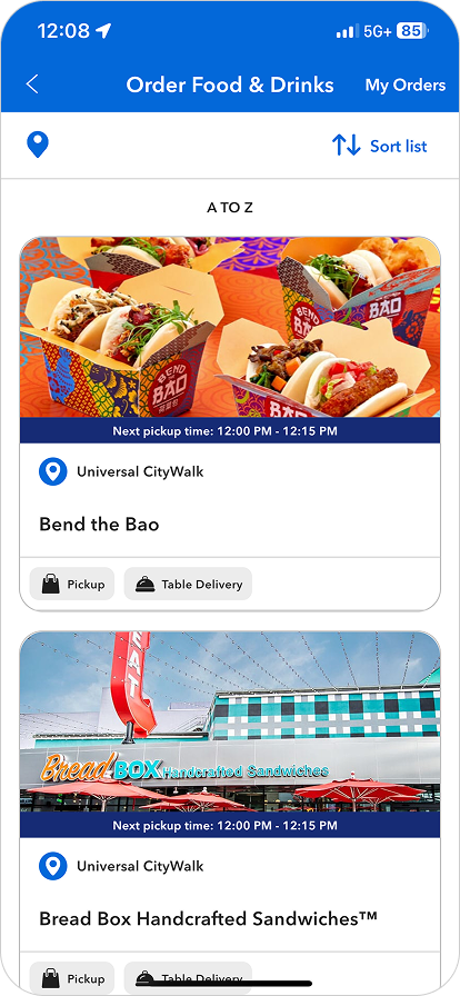
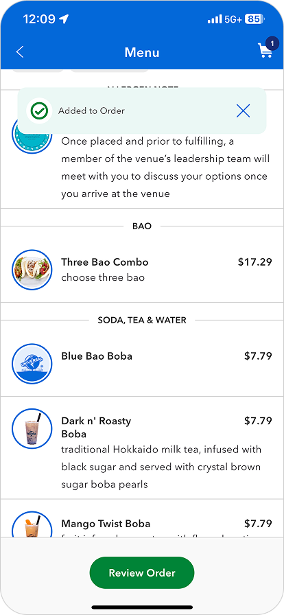
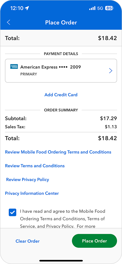
Ordering From Kiosk At Universal Epic Universe
SEE IT IN ACTION
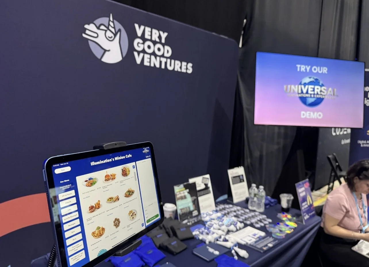
Since this Product was built in Flutter, they wanted to show how well the Kiosks functions within this code base. My work was featured during a presentation with our vendor partner, Very Good Ventures.

WHAT’S NEXT…
Theming! Next up.
